Would it be possible to have the catalog images and price/quantity information
closer together when browsing a seller's store? Currently, while browsing items
for sale in a BL shop, the catalog images and price/quantity info are almost
one entire screen apart. The images are on the left side of the screen and the
price/quantity is on the edge of the right side of the screen. To see what I
mean, take a look at my own shop and click on the link for "show all items":
When scrolling through that screen, I cannot easily see the images and prices
without constantly looking left and right, left and right, over and over again.
Maybe I have tunnel vision or too large a monitor, but I could shop and scroll
through listings 2-3 times faster if I could see the images and prices next to
each other.
Of course, some people are comfortable with the way things are now, so please
make this an OPTION for buyers if at all possible. Thanks in advance.
No. Description, then price, and image on the far right. I guess yours would
work too, but either way is good.
I would prefer image, price/quantity and then description. But that's just me.
When I shop, I first see the image, check the price/quantity and then scan the
description for any special comments. But it should not be too much trouble to
make this user-defined.
I have a wide-screen monitor and bad vision. So I usually have my face a foot
or less away from the screen. If I try to change the screen size, it either makes
the type smaller and more difficult to read, or cluttered and bunched too close
together.
Foster
I think people's eyes will naturally gravitate toward the image rather than the
text. And since the convention we are accustomed to is to scan left to right
it might be a bit awkward to be pulled first to the right by the image and then
have to go back to the left for more information, even for people who don't consciously
realize why it feels weird. So the images are in the right place.
The real question then becomes whether:
(1) it is better to have the price next to the image to minimize scanning across
the field of vision and putting description last, which people can look at if/when
more detail is necessary.
(2) or keeping the left-to-right consistency of (a) part specifics (image), (b)
part specifics (description), (c) price, vs. alternating it us as part specifics,
price, more part specifics.
Really it's not worth debating though unless we could look at mock displays and
see what really works for the eyes.
Would it be possible to have the catalog images and price/quantity information
closer together when browsing a seller's store? Currently, while browsing items
for sale in a BL shop, the catalog images and price/quantity info are almost
one entire screen apart. The images are on the left side of the screen and the
price/quantity is on the edge of the right side of the screen. To see what I
mean, take a look at my own shop and click on the link for "show all items":
When scrolling through that screen, I cannot easily see the images and prices
without constantly looking left and right, left and right, over and over again.
Maybe I have tunnel vision or too large a monitor, but I could shop and scroll
through listings 2-3 times faster if I could see the images and prices next to
each other.
Of course, some people are comfortable with the way things are now, so please
make this an OPTION for buyers if at all possible. Thanks in advance.
Thor
It will display differently for everybody, depending on screen size, resolution
and how wide you have your browser stretched, as the table the items are displayed
in is set to scale to 100% width of the page. If you pull the right side of your
browser in, this shouldn't be an issue.
Would it be possible to have the catalog images and price/quantity information
closer together when browsing a seller's store? Currently, while browsing items
for sale in a BL shop, the catalog images and price/quantity info are almost
one entire screen apart. The images are on the left side of the screen and the
price/quantity is on the edge of the right side of the screen. To see what I
mean, take a look at my own shop and click on the link for "show all items":
When scrolling through that screen, I cannot easily see the images and prices
without constantly looking left and right, left and right, over and over again.
Maybe I have tunnel vision or too large a monitor, but I could shop and scroll
through listings 2-3 times faster if I could see the images and prices next to
each other.
Of course, some people are comfortable with the way things are now, so please
make this an OPTION for buyers if at all possible. Thanks in advance.
Thor
twice in the last year I have had buyers buy this part
only to complain that I sent the wrong colour.(bright pink rather than white)
I am sure that there are more examples of this in the catalog.
Any move which would mean that even more people could avoid reading the part
description, and only shop using the pictures/price, would likely cause more
problems of this type.
Slim (who would add a small pic of the bright pink plate even only his camera
was working)
You make a very good valid point Slim. One that I had not thought of prior to
your post. Although I would still read the description even if the image and
price were closer together, I can see how some buyers may not. Would it help
to add the color name right under the image? That would probably need its own
suggestion however.
Would it help
to add the color name right under the image? That would probably need its own
suggestion however.
Foster
How about a color square? That would add a visual clue about the color, in addition
to the color in the description.
Perhaps both. A color square is nice. I like that. It would have to be quite
small though, maybe like the size of the feedback triangles, so as to avoid stealing
the glory from the part image. It could be difficult to tell the shade perhaps,
like brown vs reddish brown or dark gray vs dark bluish gray. So I still think
color name should accompany it. People might find a long list of color squares
on their screen when shopping or looking at their cart kind of annoying though
unless very small. I'd say maybe if the square was beneath and left-justified
it might be best.
Matt
Would it help to add the color name right under the image? That would probably need its own suggestion however.
Foster
You should make that suggestion. I would vote yes for sure. I don't see why the
color name is not listed beneath the images already. Could save a lot of headache.
That would probably be the best suggestion I've seen in a while. I'm sure some
people would vote no. No idea why, maybe because they don't like to read? Or
they just like to argue. Seriously, color name below image. I think that is very
professional and at the same time can help avoid buying/selling mistakes.
Matt
Sorry, but this makes no sense to me. Why would we want to move the color away
from the description and put it below the picture? It makes way more sense to
have it as part of the description.
Anything placed under the picture will cause the pages to become longer as well.
I much prefer the color swatch suggestion. I think making them the same height
as the pictures, maybe 15 pixels wide, and displaying them tot he right of the
picture would be a great solution.
I tend to have the opposite problem as Slim, in that my minions see the white
picture and pull white parts, even though the order is actually for medium violet
or some other rare color. I generally catch this when checking the orders, but
anything that will help get it right the first time would be helpful.
Troy
Sorry for the confusion, I didn't mean take color name out of the description.
Agreed, it should stay there, but it would help to have it by the part image
as well. My only issue with the swatches is I wouldn't want to have to scroll
down a page containing a great big rainbow colored strip of squares. Which is
why they should be really small. Which in turn is why it might help to have the
color name by the swatch. Otherwise if as large as the picture itself that would
get annoying, particularly since the whole purpose would be to make clear the
color of parts for which the part images are not correct (i.e. white), which
are few and far between.
Matt
I'm not sure why having colors while you scroll down would be an issue. I would
find it more annoying to have the color added below the picture, making the page
longer to scroll through.
As an added benefit, having color swatches for all colors will also be of benefit
when there is a picture in the right color, but one that is not very clear or
very accurate. Due to lighting, colorspace, etc. pictures of similar colors
can appear to be a different color then they actually are. Color swatches would
be consistent and would help avoid problems.
As said elsewhere in this thread, many of use are more "visual", and being able
to look at a quick glance would be easier than reading the color.
Troy
That's a good point. I hadn't thought of that but there are a lot more "correctly"
colored images that look like the wrong color due to the lighting in the photo
than there are parts without color shown. I stand corrected. But how big do these
swatches need to be? Perhaps I am just imagining color squares way bigger than
people are actually proposing.
Matt
Someone in the other thread suggested just the background around the image:
Would it be possible to have the catalog images and price/quantity information
closer together when browsing a seller's store? Currently, while browsing items
for sale in a BL shop, the catalog images and price/quantity info are almost
one entire screen apart. The images are on the left side of the screen and the
price/quantity is on the edge of the right side of the screen. To see what I
mean, take a look at my own shop and click on the link for "show all items":
When scrolling through that screen, I cannot easily see the images and prices
without constantly looking left and right, left and right, over and over again.
Maybe I have tunnel vision or too large a monitor, but I could shop and scroll
through listings 2-3 times faster if I could see the images and prices next to
each other.
Of course, some people are comfortable with the way things are now, so please
make this an OPTION for buyers if at all possible. Thanks in advance.
Thor
twice in the last year I have had buyers buy this part
only to complain that I sent the wrong colour.(bright pink rather than white)
I am sure that there are more examples of this in the catalog.
Any move which would mean that even more people could avoid reading the part
description, and only shop using the pictures/price, would likely cause more
problems of this type.
Slim (who would add a small pic of the bright pink plate even only his camera
was working)
I agree with this part of the thread. I myself have made shipping mistakes by
looking at the color of the part in the picture instead of reading the color
in the description.
To explain why this happens, for me, it is because I am very visual, I am drawn
more to the pictures than the words. I think, to some extent, all of us AFOL's
must be this way. LEGO is about pictures, not words. Even the instructions
have no words. It may be why we are drawn to this hobby, because we are visual
people.
JMO, but I like the idea of putting a visual key with the part, especially when
a "stock" color picture is used because no actual image exists.
I do not see the need to speed up shopping. I my experience it is already very
easy to spend a lot of money in a very short time.
Boris
In Suggestions, fosterbengoshi writes:
Would it be possible to have the catalog images and price/quantity information
closer together when browsing a seller's store? Currently, while browsing items
for sale in a BL shop, the catalog images and price/quantity info are almost
one entire screen apart. The images are on the left side of the screen and the
price/quantity is on the edge of the right side of the screen. To see what I
mean, take a look at my own shop and click on the link for "show all items":
When scrolling through that screen, I cannot easily see the images and prices
without constantly looking left and right, left and right, over and over again.
Maybe I have tunnel vision or too large a monitor, but I could shop and scroll
through listings 2-3 times faster if I could see the images and prices next to
each other.
Of course, some people are comfortable with the way things are now, so please
make this an OPTION for buyers if at all possible. Thanks in advance.
Description, Price, Image. I would like this order.
Voted YES, hopefully to get a more flexible user-friendly listing capability
and sorting order.
Arnoud
In Suggestions, fosterbengoshi writes:
Would it be possible to have the catalog images and price/quantity information
closer together when browsing a seller's store? Currently, while browsing items
for sale in a BL shop, the catalog images and price/quantity info are almost
one entire screen apart. The images are on the left side of the screen and the
price/quantity is on the edge of the right side of the screen. To see what I
mean, take a look at my own shop and click on the link for "show all items":
When scrolling through that screen, I cannot easily see the images and prices
without constantly looking left and right, left and right, over and over again.
Maybe I have tunnel vision or too large a monitor, but I could shop and scroll
through listings 2-3 times faster if I could see the images and prices next to
each other.
Of course, some people are comfortable with the way things are now, so please
make this an OPTION for buyers if at all possible. Thanks in advance.
Thor
Voted NO.
The actual order in fine for me and changing it would cause more buyers to not
reading the descriptions, IMO.
Ronald
I was thinking much the same on this one, as per Slim's post too. Another issue
with buyers not reading descriptions is where sellers add text to the description
and it is not easily noticed.
example:
Black Brick 1 x 1 (standard BL desc)
Black Brick 1 x 1 some small marks (BL desc + seller added comments)
In this case the seller added remarks are probably the most important part of
the description for the buyer to see and read.
Maybe it could be hard-coded into the system that any seller added text would
show as bold and/or in a different colour such as blue (not red please, people
think of red as negative or problem and the added descriptions can be positive
things too!). It would then be clear(er) to the buyer what is the standard part
description and what is added information specific to the part(s) offered by
that seller. Is this worth suggesting perhaps?
Robert
Good idea, but many sellers already spent a lot of time with formatting their
descriptions, so it should be well thought HOW to mark these.
Maybe by separating the BrickLink description from the seller's descripton.
Ronald
Would it be possible to have the catalog images and price/quantity information
closer together when browsing a seller's store? Currently, while browsing items
for sale in a BL shop, the catalog images and price/quantity info are almost
one entire screen apart. The images are on the left side of the screen and the
price/quantity is on the edge of the right side of the screen. To see what I
mean, take a look at my own shop and click on the link for "show all items":
When scrolling through that screen, I cannot easily see the images and prices
without constantly looking left and right, left and right, over and over again.
Maybe I have tunnel vision or too large a monitor, but I could shop and scroll
through listings 2-3 times faster if I could see the images and prices next to
each other.
Of course, some people are comfortable with the way things are now, so please
make this an OPTION for buyers if at all possible. Thanks in advance.
Thor
Foster,
I think that your issue may be easily solved by adjusting the width of your browser
window.
I did as you asked above and viewed your store and didn't see any problems with
it. I too have a widescreen large monitor, but I browse Bricklink and other
websites with two browser windows side by side. In my set up this provides a
wide enough view that I don't have to scroll sideways, and keeps the picture
and price closer together.
I did not notice the problem you mention until I viewed the page in a full screen
browser window. Man that would get annoying rather quick!
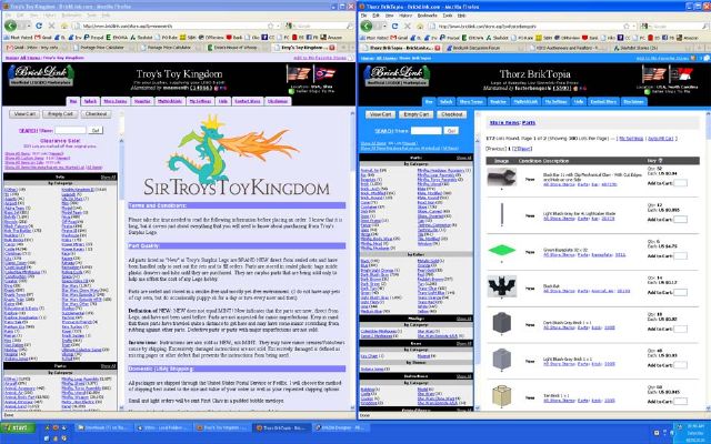
See my pictures below for an example of the difference.
Rather then move things around, I think a simpler solution would be to hard code
a size into the page. Most other aspects of BrickLink, such as the forum, have
a set width. I don't see why a store display can't also have a fixed width.
Instead of setting it to 100% it could be set to 540 pixels, wide enough to
display the info, but not so wide as to cause side scrolling). In my picture,
my logo is 500 pixels wide, so I think 540 is a good number to use.
Dunno can you hack ground a screenshot using ms paint or something till it looks
similiar to what you want it to look around, and save jpg and include in post?
)
)