Redisplay Messages: Compact | Brief | All | Full Show Messages: All | Without Replies| Author: | TBS  | | Posted: | Apr 10, 2018 08:01 | | Subject: | Re: Price guide rant | | Viewed: | 79 times | | Topic: | Suggestions | |
| In Suggestions, andrewyoung0811 writes:
| | In Suggestions, LaineeP writes:
| | I know that this has probably been beat to death, but I have a suggestion. I,
as well as others I'm sure, have complained about the average prices that
are grossly inflated due to very high priced parts. On the used side of the guide
it seems it is always the same 2 stores (ex $39.95 for a $0.20 piece).
Why can't we do what they do in some sporting events - throw out the lowest
and highest and then average. I'm sure there is a way to do this.
Lainee
|
Interesting idea and it does solve a problem. Another method could be taking
the median rather than the mean. Or the seller could have the option to select
his default preference (eg. Median or Mean Value).
|
median is already there via the quantity average.
it is stupid to take out the lowest and highest because you cant cancel these,
as they are legit buyable offers.
Furthermore would you delete a part with 4.5 cent as lowest, but dont do to one
thats exactly 5 cent?
The highest parts dont have much impact on the price, because one part at 20
dollars,
is not much recognizable in a complete offer from 20000 parts from 10-15 cent.
Problem is more, people desperately hang on to non weighted avg prices in stead
of their weighted qty avg.
|
 |
| Author: | capcreations | | Posted: | Apr 10, 2018 07:30 | | Subject: | Re: Price guide rant | | Viewed: | 77 times | | Topic: | Suggestions | |
| In Suggestions, LaineeP writes:
| | I know that this has probably been beat to death, but I have a suggestion. I,
as well as others I'm sure, have complained about the average prices that
are grossly inflated due to very high priced parts. On the used side of the guide
it seems it is always the same 2 stores (ex $39.95 for a $0.20 piece).
Why can't we do what they do in some sporting events - throw out the lowest
and highest and then average. I'm sure there is a way to do this.
Lainee
|
Interesting idea and it does solve a problem. Another method could be taking
the median rather than the mean. Or the seller could have the option to select
his default preference (eg. Median or Mean Value).
|
|
| Author: | Brickwilbo | | Posted: | Apr 10, 2018 04:25 | | Subject: | Re: Price guide rant | | Viewed: | 120 times | | Topic: | Suggestions | |
| In Suggestions, LaineeP writes:
| | I know that this has probably been beat to death, but I have a suggestion. I,
as well as others I'm sure, have complained about the average prices that
are grossly inflated due to very high priced parts. On the used side of the guide
it seems it is always the same 2 stores (ex $39.95 for a $0.20 piece).
Why can't we do what they do in some sporting events - throw out the lowest
and highest and then average. I'm sure there is a way to do this.
Lainee
|
Here you go https://www.bricklink.com/priceGuideSettings.asp?viewFrom=P
|
|
| Author: | yorbrick | | Posted: | Apr 10, 2018 04:09 | | Subject: | Re: Price guide rant | | Viewed: | 69 times | | Topic: | Suggestions | |
| In Suggestions, LaineeP writes:
| | I know that this has probably been beat to death, but I have a suggestion. I,
as well as others I'm sure, have complained about the average prices that
are grossly inflated due to very high priced parts. On the used side of the guide
it seems it is always the same 2 stores (ex $39.95 for a $0.20 piece).
Why can't we do what they do in some sporting events - throw out the lowest
and highest and then average. I'm sure there is a way to do this.
Lainee
|
Why not throw out any that are not average, then average what is left.
|
| Author: | crxefx | | Posted: | Apr 10, 2018 00:05 | | Subject: | Re: Price guide rant | | Viewed: | 78 times | | Topic: | Suggestions | |
| throw out the lowest and highest and then average.
Thats actually a pretty good idea! Ya, you definately can't list parts by
average price
|
| Author: | LaineeP | | Posted: | Apr 9, 2018 22:42 | | Subject: | Price guide rant | | Viewed: | 317 times | | Topic: | Suggestions | | Status: | Open | | Vote: | [Yes|No] | |
| I know that this has probably been beat to death, but I have a suggestion. I,
as well as others I'm sure, have complained about the average prices that
are grossly inflated due to very high priced parts. On the used side of the guide
it seems it is always the same 2 stores (ex $39.95 for a $0.20 piece).
Why can't we do what they do in some sporting events - throw out the lowest
and highest and then average. I'm sure there is a way to do this.
Lainee
|
|
| Author: | Brickwilbo | | Posted: | Apr 9, 2018 07:31 | | Subject: | Re: After posting feedback "Go Back" Button | | Viewed: | 49 times | | Topic: | Suggestions | |
| In Suggestions, randyipp writes:
| | Please fix this "go back" button to load the orders page not actually go back
a page. This requires me to hit refresh in order to see what order needs feedback
next.
It's not an issue when there are only 1 or 2 but more than that and
it can get a little annoying.
|
You can use the Mass feedback link for 3 or more orders.
| |
This issue was observed on Chrome, it may react differently on other browsers,
if so I would love to hear about which ones if the button works!
Thanks!
|
|
|
| Author: | Captain.M | | Posted: | Apr 9, 2018 07:09 | | Subject: | Re: After posting feedback "Go Back" Button | | Viewed: | 49 times | | Topic: | Suggestions | |
| +1
In Suggestions, randyipp writes:
| | Please fix this "go back" button to load the orders page not actually go back
a page. This requires me to hit refresh in order to see what order needs feedback
next. It's not an issue when there are only 1 or 2 but more than that and
it can get a little annoying.
This issue was observed on Chrome, it may react differently on other browsers,
if so I would love to hear about which ones if the button works!
Thanks!
|
|
|
| Author: | DeLuca | | Posted: | Apr 8, 2018 14:29 | | Subject: | Re: “Report” Button | | Viewed: | 41 times | | Topic: | Suggestions | |
| In Suggestions, Brickwilbo writes:
| | In Suggestions, todeluca writes:
| | Due to another spammer having appeared on the Forum, and my having to message
the Admins about it, I now think that Bricklink should have a designated “Report”
button on each Forum post (as is the case on Eurobricks). This would make reporting
spam/problem members/etc much easier, since the Admins could be contacted immediately
upon seeing the offending post and automatically be directed to the specific
post in question.
Is this something that Bricklink can implement?
|
Report here https://www.bricklink.com/problemMessage.asp
|
This is a bit more complicated than what I had in mind (and I am not even sure
where to access it!).
Perhaps the button on each post could be a link to this page, and a category
of “Other” could be added.
|
|
| Author: | WoutR | | Posted: | Apr 8, 2018 05:32 | | Subject: | Re: “Report” Button | | Viewed: | 41 times | | Topic: | Suggestions | |
| In Suggestions, Brickwilbo writes:
| | In Suggestions, todeluca writes:
| | Due to another spammer having appeared on the Forum, and my having to message
the Admins about it, I now think that Bricklink should have a designated “Report”
button on each Forum post (as is the case on Eurobricks). This would make reporting
spam/problem members/etc much easier, since the Admins could be contacted immediately
upon seeing the offending post and automatically be directed to the specific
post in question.
Is this something that Bricklink can implement?
|
Report here https://www.bricklink.com/problemMessage.asp
|
It works, but such a button would be a very useful alternative.
|
|
| Author: | Brickwilbo | | Posted: | Apr 8, 2018 05:18 | | Subject: | Re: “Report” Button | | Viewed: | 56 times | | Topic: | Suggestions | |
| In Suggestions, todeluca writes:
| | Due to another spammer having appeared on the Forum, and my having to message
the Admins about it, I now think that Bricklink should have a designated “Report”
button on each Forum post (as is the case on Eurobricks). This would make reporting
spam/problem members/etc much easier, since the Admins could be contacted immediately
upon seeing the offending post and automatically be directed to the specific
post in question.
Is this something that Bricklink can implement?
|
Report here https://www.bricklink.com/problemMessage.asp
|
| Author: | StarBrick | | Posted: | Apr 8, 2018 04:15 | | Subject: | Re: “Report” Button | | Viewed: | 38 times | | Topic: | Suggestions | |
| | YES PLEASE!!! |
| Author: | DeLuca | | Posted: | Apr 8, 2018 04:05 | | Subject: | “Report” Button | | Viewed: | 136 times | | Topic: | Suggestions | | Status: | Open | | Vote: | [Yes|No] | |
| Due to another spammer having appeared on the Forum, and my having to message
the Admins about it, I now think that Bricklink should have a designated “Report”
button on each Forum post (as is the case on Eurobricks). This would make reporting
spam/problem members/etc much easier, since the Admins could be contacted immediately
upon seeing the offending post and automatically be directed to the specific
post in question.
Is this something that Bricklink can implement?
|
| Author: | crxefx | | Posted: | Apr 7, 2018 17:46 | | Subject: | Re: After posting feedback "Go Back" Button | | Viewed: | 48 times | | Topic: | Suggestions | |
| | Yes, That would be a really nice thing to fix. I use chrome also |
| Author: | randyipp | | Posted: | Apr 7, 2018 17:07 | | Subject: | After posting feedback "Go Back" Button | | Viewed: | 166 times | | Topic: | Suggestions | | Status: | Implemented | |
| Please fix this "go back" button to load the orders page not actually go back
a page. This requires me to hit refresh in order to see what order needs feedback
next. It's not an issue when there are only 1 or 2 but more than that and
it can get a little annoying.
This issue was observed on Chrome, it may react differently on other browsers,
if so I would love to hear about which ones if the button works!
Thanks!
|
| Author: | Teup | | Posted: | Apr 7, 2018 06:08 | | Subject: | Re: ADYEN | | Viewed: | 51 times | | Topic: | Suggestions | |
| Voted yes! I feel like PayPal is becoming overly important on Bricklink. That's
not healthy with a commercial party. PayPal is already getting more dubious.
Monopoly invariably leads to trouble.
In Suggestions, RobErNat writes:
|
|
|
| Author: | CPgolfaddict | | Posted: | Apr 4, 2018 10:39 | | Subject: | Re: Tax information in order export | | Viewed: | 40 times | | Topic: | Suggestions | |
| Please keep up the pressure. If everyone who needs to pay Sales Tax quarterly
raises a suggestion, will they act?
https://www.bricklink.com/message.asp?ID=1069826
In Suggestions, NewTown_Bricks writes:
| | I'm working on my quarterly tax filing and was hoping to find a column in
the order export information for the tax that was collected on in-state sales.
Alas, it is not.
For those of us that collect sales tax, having that field in the order download
spreadsheet would be extremely helpful, along with the street address and city/zip
code. All of this information is required when filing sales taxes in NY.
Thank you for all you do!
Matt
|
|
|
| Author: | randyf | | Posted: | Apr 3, 2018 16:50 | | Subject: | Re: parts colour matt or shiny | | Viewed: | 31 times | | Topic: | Suggestions | |
| In Suggestions, todeluca writes:
| | In Suggestions, SylvainLS writes:
| | Softer materials (plants, horns…) are matt, but I don’t think there are bricks
that come in both ABS and PP or other soft plastic.
|
| | no bricks come in both shiny and matt,
|
Actually, part (53451) originally came in shiny (harder) plastic when it was
first introduced, but was later changed to matte (softer) plastic. I am not sure
exactly when this occurred, since Bricklink does not differentiate between the
original and revised versions of the part.
|
I think the change occurred very quickly after the Vikings theme as the only
ones I have ever found in ABS are white and from the Vikings theme.
Cheers,
Randy
|
|
| Author: | SylvainLS | | Posted: | Apr 3, 2018 16:21 | | Subject: | Re: parts colour matt or shiny | | Viewed: | 24 times | | Topic: | Suggestions | |
| In Suggestions, todeluca writes:
| | In Suggestions, SylvainLS writes:
| | Softer materials (plants, horns…) are matt, but I don’t think there are bricks
that come in both ABS and PP or other soft plastic.
|
| | no bricks come in both shiny and matt,
|
Actually, part (53451) originally came in shiny (harder) plastic when it was
first introduced, but was later changed to matte (softer) plastic. I am not sure
exactly when this occurred, since Bricklink does not differentiate between the
original and revised versions of the part.
|
Okay. I can see how there could be other such examples of LEGO tweaking materials
from time to time.
Anyway, I think for such little differences, a simple note should suffice (something
like “Early parts came in harder, more shiny plastic.”). There should be no
need for a doubling of all the colours with shiny/matt variants… otherwise we
could also want a new colour for each material (cloth, rubber, paint…). There
is already enough variation in parts in the “same” material and colour to make
them sometimes hard to recognize.
|
|
| Author: | DeLuca | | Posted: | Apr 3, 2018 15:38 | | Subject: | Re: parts colour matt or shiny | | Viewed: | 34 times | | Topic: | Suggestions | |
| In Suggestions, SylvainLS writes:
| | Softer materials (plants, horns…) are matt, but I don’t think there are bricks
that come in both ABS and PP or other soft plastic.
|
| | no bricks come in both shiny and matt,
|
Actually, part (53451) originally came in shiny (harder) plastic when it was
first introduced, but was later changed to matte (softer) plastic. I am not sure
exactly when this occurred, since Bricklink does not differentiate between the
original and revised versions of the part.
|
|
| Author: | SylvainLS | | Posted: | Apr 3, 2018 10:08 | | Subject: | Re: parts colour matt or shiny | | Viewed: | 39 times | | Topic: | Suggestions | |
| In Suggestions, az0 writes:
| | To admin,
Regarding parts and colour entry.
It would be good if there were an entry to say whether the colour is matt or
shiny. I have to replace a part on Harry Potter Knight's bus. The original
was shiny black but the part I received as a replacement was matt.
On this particularly set it is rather noticeable so rather than have to email
each seller to ask if they have a shiny black part it would be good if it were
stated. Not sure if Lego make the distinction but it makes a difference to the
look of the set when its a visible part.
|

All new bricks are shiny. It’s when they are used and get lots of micro-scratches
that they become matt.
Softer materials (plants, horns…) are matt, but I don’t think there are bricks
that come in both ABS and PP or other soft plastic.
So,
either the shiny/matt clash comes from different materials and it’s useless to
differentiate “colour X shiny” and “colour X matt” on BL because no bricks come
in both shiny and matt,
or the shiny/matt clash comes from new/mint bricks vs. older/scratched bricks
and it’s a matter of asking sellers in what condition are their bricks prior
to ordering.
|
|
| Author: | randyipp | | Posted: | Apr 3, 2018 09:58 | | Subject: | Re: parts colour matt or shiny | | Viewed: | 28 times | | Topic: | Suggestions | |
| In Suggestions, az0 writes:
| | To admin,
Regarding parts and colour entry.
It would be good if there were an entry to say whether the colour is matt or
shiny. I have to replace a part on Harry Potter Knight's bus. The original
was shiny black but the part I received as a replacement was matt.
On this particularly set it is rather noticeable so rather than have to email
each seller to ask if they have a shiny black part it would be good if it were
stated. Not sure if Lego make the distinction but it makes a difference to the
look of the set when its a visible part.
|
What part are you referring to? Are you sure it wasn't just a worn part?
|
|
| Author: | az0 | | Posted: | Apr 3, 2018 09:39 | | Subject: | parts colour matt or shiny | | Viewed: | 102 times | | Topic: | Suggestions | | Status: | Discarded | |
| To admin,
Regarding parts and colour entry.
It would be good if there were an entry to say whether the colour is matt or
shiny. I have to replace a part on Harry Potter Knight's bus. The original
was shiny black but the part I received as a replacement was matt.
On this particularly set it is rather noticeable so rather than have to email
each seller to ask if they have a shiny black part it would be good if it were
stated. Not sure if Lego make the distinction but it makes a difference to the
look of the set when its a visible part.
|
|
| Author: | mikmo | | Posted: | Mar 29, 2018 18:42 | | Subject: | Re: Mobile-Friendly Website | | Viewed: | 88 times | | Topic: | Suggestions | |
| I understand your wish.
But if there is one thing that it is not, it is simple.
Making and old site based partly on classic ASP mobile friendly is everything
else than simple.
That is probably why they are going with an app.
Kind regards
Mikael MikMo
|
|
| Author: | sancho10 | | Posted: | Mar 29, 2018 18:24 | | Subject: | Re: Mobile-Friendly Website | | Viewed: | 39 times | | Topic: | Suggestions | |
| Thanks for the answer!
Very good to know this from a Bricklink administrator!
My post has no intention to speed up the process but to find answers.
I tried to find related posts but I didn't see the post you've shared
now.
I wish you all a good job on this innovation!
I look forward to see the new mobile website.
Thank you for your work!
Marcos
In Suggestions, StormChaser writes:
| | In Suggestions, sancho10 writes:
| | I think it's time to ask Bricklink to make a very simple but very useful
change: a MOBILE-FRIENDLY website!
|
Here is a post regarding the subject from a site administrator:
https://www.bricklink.com/message.asp?ID=1030721
Clearly BrickLink is aware of the necessity of being mobile-friendly. I don't
believe a suggestion or a vote by members will speed things up any.
If you'd like to see what's being worked on and what's planned for
the future, then you can check this page (athough it's definitely not a comprehensive
list - BrickArms, for example, which was a new feature, never showed up on the
Roadmap):
https://www.bricklink.com/help.asp?helpID=2453
|
|
|
| Author: | StormChaser | | Posted: | Mar 29, 2018 18:02 | | Subject: | Re: Mobile-Friendly Website | | Viewed: | 55 times | | Topic: | Suggestions | |
| In Suggestions, sancho10 writes:
| | I think it's time to ask Bricklink to make a very simple but very useful
change: a MOBILE-FRIENDLY website!
|
Here is a post regarding the subject from a site administrator:
https://www.bricklink.com/message.asp?ID=1030721
Clearly BrickLink is aware of the necessity of being mobile-friendly. I don't
believe a suggestion or a vote by members will speed things up any.
If you'd like to see what's being worked on and what's planned for
the future, then you can check this page (athough it's definitely not a comprehensive
list - BrickArms, for example, which was a new feature, never showed up on the
Roadmap):
https://www.bricklink.com/help.asp?helpID=2453
|
|
| Author: | MarshMan80 | | Posted: | Mar 29, 2018 17:59 | | Subject: | Re: Mobile-Friendly Website | | Viewed: | 35 times | | Topic: | Suggestions | |
| In Suggestions, sancho10 writes:
| | Hello everyone,
I think it's time to ask Bricklink to make a very simple but very useful
change: a MOBILE-FRIENDLY website!
Nowadays the majority of online worldwide buyers are using the mobile to complete
their purchases.
For example, in China the 83% of customers are buying from a mobile device.
Benefits:
- Buyers are more satisfied and the customer experience would be increased.
- Stores would increase the number of orders received
- Bricklink would have new customers that now are potential customers but, due
to this lack are not customers yet.
The competitor "BrickOwl" has a mobile-friendly website.
But BRICKLINK you are the largest LEGO Marketplace!
Please BRICKLINK, the whole community needs a mobile-friendly site!
|
They are currently in development of an app. Dont know of an ETA for it yet.
| |
Guys please, support my suggestion 
|
|
|
| Author: | sancho10 | | Posted: | Mar 29, 2018 17:51 | | Subject: | Mobile-Friendly Website | | Viewed: | 108 times | | Topic: | Suggestions | | Status: | Open | | Vote: | [Yes|No] | |
| Hello everyone,
I think it's time to ask Bricklink to make a very simple but very useful
change: a MOBILE-FRIENDLY website!
Nowadays the majority of online worldwide buyers are using the mobile to complete
their purchases.
For example, in China the 83% of customers are buying from a mobile device.
Benefits:
- Buyers are more satisfied and the customer experience would be increased.
- Stores would increase the number of orders received
- Bricklink would have new customers that now are potential customers but, due
to this lack are not customers yet.
The competitor "BrickOwl" has a mobile-friendly website.
But BRICKLINK you are the largest LEGO Marketplace!
Please BRICKLINK, the whole community needs a mobile-friendly site!
Guys please, support my suggestion
|
|
| Author: | sancho10 | | Posted: | Mar 29, 2018 17:26 | | Subject: | Re: Responsive/mobile Web Design | | Viewed: | 32 times | | Topic: | Suggestions | |
| Yes, I'm not using BrickOwl but I saw that they have a mobile-friendly website.
Bricklink as the largest LEGO Marketplace MUST make this simple but very useful
change.
In Suggestions, CheshireBricKs writes:
| | Agreed, that would be fantastic. Tired of zooming in and out all the time. Never
had to do it once over on BrickOwl.
|
|
| Author: | bb680938 | | Posted: | Mar 29, 2018 17:23 | | Subject: | Re: Responsive/mobile Web Design | | Viewed: | 33 times | | Topic: | Suggestions | |
| Agreed, that would be fantastic. Tired of zooming in and out all the time. Never
had to do it once over on BrickOwl.
|
| Author: | sancho10 | | Posted: | Mar 29, 2018 17:18 | | Subject: | Re: Responsive/mobile Web Design | | Viewed: | 36 times | | Topic: | Suggestions | |
| Yes, it would be fantastic to have a mobile-friendly site.
Nowadays the majority of online worldwide buyers are using the mobile to complete
their purchases.
I think that a new mobile design would increase the customer experience but also
increase the number of orders received by the store.
Please BRICKLINK, the whole community needs a mobile-friendly site!
In Suggestions, cmcmahon writes:
| | The site would be a lot easier if it had a responsive design, allowing it to
adjust to the user's screen size/be mobile device friendly. I'd be happy
to help.
|
|
|
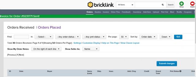
| Author: | Teup | | Posted: | Mar 28, 2018 18:54 | | Subject: | Re: Move header buttons to the left side screen | | Viewed: | 27 times | | Topic: | Suggestions | |
| In Suggestions, Teup writes:
| | I agree it's way too wide. I have a large widescreen but even here "current
orders" and "filed orders" is off the screen. What you can at least do for those
two particular options (and perhaps others) is bookmark their links and add them
to your bookmark bar of your browser, so you can access them by clicking there
instead of having to scroll right.
I think before improving the interface, first of all a bug needs to be fixed.
This orders received display is way too wide because of all these columns. And
we cannot turn off columns such as additional charges, additional charges 2,
and insurance. I've never used insurance yet it takes up the center of the
display. These columns used to be mandatory for some mysterious reason and their
checkboxes were greyed out in "customize display", but now they have been enabled,
but modifying them doesn't do anything. You can check and uncheck them and
the orders display remains exactly the same. If this bug is fixed, we will be
able to cut down on the width of that page quite a bit, and it can bring a couple
of buttons back in sight. And it will make my list of received orders more comfortable
to look at, too.
In Suggestions, Pazzo writes:
| | Hi all,
when I am in my order page...all buttons are centered above the site.
But using an old fashioned 4/3 monitor, half of the buttons are outside my view,
and I need to use the sliding bars everytime I want to select one of them.
If all the buttons can be alligned from the left side of the screeen, this would
improve a lot.
Anybody has the same problem?
Be cool and have fun
Eric
|
|
I see now that besides this bug there's also another problem that recently
emerged. The orders pages used to have zoom levels that were independent from
the rest of the site. I remember requesting this in the past, this was done specifically
for making these pages fit. That, however, has now been undone again. All pages
have a single linked zoom level. That means you're forced to choose between
either an order list that fits but a Bricklink that's a narrow strip with
half of the screen blank, or a Bricklink that fills the screen reasonably well
but an order page that is cut off on the right side.
|
|
| Author: | Teup | | Posted: | Mar 28, 2018 18:47 | | Subject: | Re: Move header buttons to the left side screen | | Viewed: | 27 times | | Topic: | Suggestions | |
| I agree it's way too wide. I have a large widescreen but even here "current
orders" and "filed orders" is off the screen. What you can at least do for those
two particular options (and perhaps others) is bookmark their links and add them
to your bookmark bar of your browser, so you can access them by clicking there
instead of having to scroll right.
I think before improving the interface, first of all a bug needs to be fixed.
This orders received display is way too wide because of all these columns. And
we cannot turn off columns such as additional charges, additional charges 2,
and insurance. I've never used insurance yet it takes up the center of the
display. These columns used to be mandatory for some mysterious reason and their
checkboxes were greyed out in "customize display", but now they have been enabled,
but modifying them doesn't do anything. You can check and uncheck them and
the orders display remains exactly the same. If this bug is fixed, we will be
able to cut down on the width of that page quite a bit, and it can bring a couple
of buttons back in sight. And it will make my list of received orders more comfortable
to look at, too.
In Suggestions, Pazzo writes:
| | Hi all,
when I am in my order page...all buttons are centered above the site.
But using an old fashioned 4/3 monitor, half of the buttons are outside my view,
and I need to use the sliding bars everytime I want to select one of them.
If all the buttons can be alligned from the left side of the screeen, this would
improve a lot.
Anybody has the same problem?
Be cool and have fun
Eric
|
|
|
| Author: | picabo | | Posted: | Mar 28, 2018 15:16 | | Subject: | Re: Move header buttons to the left side screen | | Viewed: | 26 times | | Topic: | Suggestions | |
| In Suggestions, Pazzo writes:
| | Hi all,
when I am in my order page...all buttons are centered above the site.
But using an old fashioned 4/3 monitor, half of the buttons are outside my view,
and I need to use the sliding bars everytime I want to select one of them.
If all the buttons can be alligned from the left side of the screeen, this would
improve a lot.
Anybody has the same problem?
Be cool and have fun
Eric
|
I can see it all if I bring the zoom down to 80% but, then of course, I can't
read anything.
Pam
|
|
| Author: | picabo | | Posted: | Mar 28, 2018 15:15 | | Subject: | Re: Move header buttons to the left side screen | | Viewed: | 30 times | | Topic: | Suggestions | |
| In Suggestions, Pazzo writes:
| | Hi all,
when I am in my order page...all buttons are centered above the site.
But using an old fashioned 4/3 monitor, half of the buttons are outside my view,
and I need to use the sliding bars everytime I want to select one of them.
If all the buttons can be alligned from the left side of the screeen, this would
improve a lot.
Anybody has the same problem?
Be cool and have fun
Eric
|
Yes exactly the same as you and it's annoying.
|
|
| Author: | Pazzo | | Posted: | Mar 28, 2018 15:13 | | Subject: | Move header buttons to the left side screen | | Viewed: | 105 times | | Topic: | Suggestions | | Status: | Open | | Vote: | [Yes|No] | |
| Hi all,
when I am in my order page...all buttons are centered above the site.
But using an old fashioned 4/3 monitor, half of the buttons are outside my view,
and I need to use the sliding bars everytime I want to select one of them.
If all the buttons can be alligned from the left side of the screeen, this would
improve a lot.
Anybody has the same problem?
Be cool and have fun
Eric
|
|
| Author: | DoMT | | Posted: | Mar 26, 2018 23:47 | | Subject: | Re: Add Cond,Item# to Sort Order received items | | Viewed: | 30 times | | Topic: | Suggestions | |
| In Suggestions, sharon12 writes:
| | Sort by Condition ~ item name ~ color name ~ comments. We find that the most
helpful in our store it may work for you. Sharon.
|
I did check this, thank you for the suggestion. Unfortunately we do need item
number rather than item name as our inventory is sorted by part number.
|
|
| Author: | bb414973 | | Posted: | Mar 25, 2018 03:28 | | Subject: | Re: Make POSTING in Forum EASIER! | | Viewed: | 66 times | | Topic: | Suggestions | |
| In Suggestions, dreambuilder71 writes:
| | In Suggestions, MarieA writes:
| | In Suggestions, dreambuilder71 writes:
| | In Suggestions, MarieA writes:
| | In Suggestions, dreambuilder71 writes:
| | So I use to post in the forum all the time. About 4 or more years ago before
the new company took over BL and changed things on here.
And it was much easier to find the POST NEW MESSAGE button than it is now. Took
me about 5 minutes to find the damn thing! That is ridiculous!
Why can't I just click on the BIG Community button at the top right on every
BL page and then on that 1st page that comes up is a BIG EASY TO FIND AND READ
button that reads: POST NEW MESSAGE!
NO, what you have to do is look at all the little buttons at the top in the grey
bar that read:
Forum, Messages, Topics, Search, Stats...
Click on Topics, click on one of those topics and in the top right corner of
those pages it says in little size font: Post New Message....
I use to be good at BL. Thanks for the frustration. I was going to post an
announcement sharing that I am only 1 feedback away from the big 5 double 0 after
almost 11 years on BL but I will probably forget how to find the Post New Message
button in the mean time.
(Why do less than half the members on BL leave feedback? I'd be over 1000
if everyone left feedback. lol. It's the same on ebay.)
James
|
You can click 'post' before choosing a topic. The link is on the same
bar as 'topics'.
|
That doesn't show on my screen at all???
|
|
I can't even screen capture my desktop to show you that the POST word doesn't
come up for me at all??? I'm confused why it's not there for me???
How can I Print Screen and then paste it in this thread?
Thanks for the help.
|
No need, I believe you  Perhaps it's hidden by CSS because your device's Perhaps it's hidden by CSS because your device's
screen is a little narrow.
|
|
| Author: | dreambuilder71 | | Posted: | Mar 25, 2018 02:43 | | Subject: | Re: Make POSTING in Forum EASIER! | | Viewed: | 31 times | | Topic: | Suggestions | |
| In Suggestions, MarieA writes:
| | In Suggestions, dreambuilder71 writes:
| | In Suggestions, MarieA writes:
| | In Suggestions, dreambuilder71 writes:
| | So I use to post in the forum all the time. About 4 or more years ago before
the new company took over BL and changed things on here.
And it was much easier to find the POST NEW MESSAGE button than it is now. Took
me about 5 minutes to find the damn thing! That is ridiculous!
Why can't I just click on the BIG Community button at the top right on every
BL page and then on that 1st page that comes up is a BIG EASY TO FIND AND READ
button that reads: POST NEW MESSAGE!
NO, what you have to do is look at all the little buttons at the top in the grey
bar that read:
Forum, Messages, Topics, Search, Stats...
Click on Topics, click on one of those topics and in the top right corner of
those pages it says in little size font: Post New Message....
I use to be good at BL. Thanks for the frustration. I was going to post an
announcement sharing that I am only 1 feedback away from the big 5 double 0 after
almost 11 years on BL but I will probably forget how to find the Post New Message
button in the mean time.
(Why do less than half the members on BL leave feedback? I'd be over 1000
if everyone left feedback. lol. It's the same on ebay.)
James
|
You can click 'post' before choosing a topic. The link is on the same
bar as 'topics'.
|
That doesn't show on my screen at all???
|
|
I can't even screen capture my desktop to show you that the POST word doesn't
come up for me at all??? I'm confused why it's not there for me???
How can I Print Screen and then paste it in this thread?
Thanks for the help.
|
|
| Author: | bb414973 | | Posted: | Mar 25, 2018 02:11 | | Subject: | Re: Make POSTING in Forum EASIER! | | Viewed: | 43 times | | Topic: | Suggestions | |
| In Suggestions, dreambuilder71 writes:
| | In Suggestions, MarieA writes:
| | In Suggestions, dreambuilder71 writes:
| | So I use to post in the forum all the time. About 4 or more years ago before
the new company took over BL and changed things on here.
And it was much easier to find the POST NEW MESSAGE button than it is now. Took
me about 5 minutes to find the damn thing! That is ridiculous!
Why can't I just click on the BIG Community button at the top right on every
BL page and then on that 1st page that comes up is a BIG EASY TO FIND AND READ
button that reads: POST NEW MESSAGE!
NO, what you have to do is look at all the little buttons at the top in the grey
bar that read:
Forum, Messages, Topics, Search, Stats...
Click on Topics, click on one of those topics and in the top right corner of
those pages it says in little size font: Post New Message....
I use to be good at BL. Thanks for the frustration. I was going to post an
announcement sharing that I am only 1 feedback away from the big 5 double 0 after
almost 11 years on BL but I will probably forget how to find the Post New Message
button in the mean time.
(Why do less than half the members on BL leave feedback? I'd be over 1000
if everyone left feedback. lol. It's the same on ebay.)
James
|
You can click 'post' before choosing a topic. The link is on the same
bar as 'topics'.
|
That doesn't show on my screen at all???
|
|
|
|
| Author: | dreambuilder71 | | Posted: | Mar 25, 2018 02:10 | | Subject: | Re: Make POSTING in Forum EASIER! | | Viewed: | 33 times | | Topic: | Suggestions | |
| In Suggestions, MarieA writes:
| | In Suggestions, dreambuilder71 writes:
| | So I use to post in the forum all the time. About 4 or more years ago before
the new company took over BL and changed things on here.
And it was much easier to find the POST NEW MESSAGE button than it is now. Took
me about 5 minutes to find the damn thing! That is ridiculous!
Why can't I just click on the BIG Community button at the top right on every
BL page and then on that 1st page that comes up is a BIG EASY TO FIND AND READ
button that reads: POST NEW MESSAGE!
NO, what you have to do is look at all the little buttons at the top in the grey
bar that read:
Forum, Messages, Topics, Search, Stats...
Click on Topics, click on one of those topics and in the top right corner of
those pages it says in little size font: Post New Message....
I use to be good at BL. Thanks for the frustration. I was going to post an
announcement sharing that I am only 1 feedback away from the big 5 double 0 after
almost 11 years on BL but I will probably forget how to find the Post New Message
button in the mean time.
(Why do less than half the members on BL leave feedback? I'd be over 1000
if everyone left feedback. lol. It's the same on ebay.)
James
|
You can click 'post' before choosing a topic. The link is on the same
bar as 'topics'.
|
That doesn't show on my screen at all???
|
|
| Author: | bb414973 | | Posted: | Mar 25, 2018 01:44 | | Subject: | Re: Make POSTING in Forum EASIER! | | Viewed: | 39 times | | Topic: | Suggestions | |
| In Suggestions, dreambuilder71 writes:
| | So I use to post in the forum all the time. About 4 or more years ago before
the new company took over BL and changed things on here.
And it was much easier to find the POST NEW MESSAGE button than it is now. Took
me about 5 minutes to find the damn thing! That is ridiculous!
Why can't I just click on the BIG Community button at the top right on every
BL page and then on that 1st page that comes up is a BIG EASY TO FIND AND READ
button that reads: POST NEW MESSAGE!
NO, what you have to do is look at all the little buttons at the top in the grey
bar that read:
Forum, Messages, Topics, Search, Stats...
Click on Topics, click on one of those topics and in the top right corner of
those pages it says in little size font: Post New Message....
I use to be good at BL. Thanks for the frustration. I was going to post an
announcement sharing that I am only 1 feedback away from the big 5 double 0 after
almost 11 years on BL but I will probably forget how to find the Post New Message
button in the mean time.
(Why do less than half the members on BL leave feedback? I'd be over 1000
if everyone left feedback. lol. It's the same on ebay.)
James
|
You can click 'post' before choosing a topic. The link is on the same
bar as 'topics'.
|
|
| Author: | dreambuilder71 | | Posted: | Mar 25, 2018 01:41 | | Subject: | Make POSTING in Forum EASIER! | | Viewed: | 105 times | | Topic: | Suggestions | | Status: | Open | | Vote: | [Yes|No] | |
| So I use to post in the forum all the time. About 4 or more years ago before
the new company took over BL and changed things on here.
And it was much easier to find the POST NEW MESSAGE button than it is now. Took
me about 5 minutes to find the damn thing! That is ridiculous!
Why can't I just click on the BIG Community button at the top right on every
BL page and then on that 1st page that comes up is a BIG EASY TO FIND AND READ
button that reads: POST NEW MESSAGE!
NO, what you have to do is look at all the little buttons at the top in the grey
bar that read:
Forum, Messages, Topics, Search, Stats...
Click on Topics, click on one of those topics and in the top right corner of
those pages it says in little size font: Post New Message....
I use to be good at BL. Thanks for the frustration. I was going to post an
announcement sharing that I am only 1 feedback away from the big 5 double 0 after
almost 11 years on BL but I will probably forget how to find the Post New Message
button in the mean time.
(Why do less than half the members on BL leave feedback? I'd be over 1000
if everyone left feedback. lol. It's the same on ebay.)
James
|
|
| Author: | Addict2Brick | | Posted: | Mar 24, 2018 19:49 | | Subject: | Re: Default feedback messages | | Viewed: | 33 times | | Topic: | Suggestions | |
| In Suggestions, sabinater09 writes:
| | It's the same for me. I use google chrome and it even syncs between devices
like my macbook and iPad.
|
Mine does too, but sometimes I can't find the same message I had posted before.
I would enjoy this suggestion.
|
| Author: | aggielandbricks | | Posted: | Mar 24, 2018 19:46 | | Subject: | Re: Default feedback messages | | Viewed: | 26 times | | Topic: | Suggestions | |
| It's the same for me. I use google chrome and it even syncs between devices
like my macbook and iPad.
|
| Author: | Brickwilbo | | Posted: | Mar 24, 2018 17:00 | | Subject: | Re: Default feedback messages | | Viewed: | 29 times | | Topic: | Suggestions | |
| In Suggestions, chetzler writes:
| | When I leave positive buyer feedback it usually results in one of three basic
messages:
One general message thanking the buyer for the order,
One thanking new buyers and welcoming them to BL,
One thanking repeat customers.
It'd be great if we had some options at the feedback screen to just select
from 4-5 pre-set messages. Something like radio buttons for message A, message
B, message C, etc.
|
My browser already makes feedbacks selectable, I only have to type the first
letter.
|
|
| Author: | chetzler | | Posted: | Mar 24, 2018 16:22 | | Subject: | Default feedback messages | | Viewed: | 90 times | | Topic: | Suggestions | | Status: | Open | | Vote: | [Yes|No] | |
| When I leave positive buyer feedback it usually results in one of three basic
messages:
One general message thanking the buyer for the order,
One thanking new buyers and welcoming them to BL,
One thanking repeat customers.
It'd be great if we had some options at the feedback screen to just select
from 4-5 pre-set messages. Something like radio buttons for message A, message
B, message C, etc.
|
| Author: | _nstbodensee_ | | Posted: | Mar 23, 2018 14:38 | | Subject: | API access to wantlist | | Viewed: | 62 times | | Topic: | Suggestions | | Status: | Open | | Vote: | [Yes|No] | |
| | Hello, an API access to the wantlist would be nice. Best regards |
| Author: | misbi | | Posted: | Mar 23, 2018 12:45 | | Subject: | API access to DimX, DimY, DimZ | | Viewed: | 92 times | | Topic: | Suggestions | | Status: | Open | | Vote: | [Yes|No] | |
| Please could we have API access to seller's own values for DimX, DimY, DimZ.
Currently, none of the below methods return any seller's own dimension data:
UserInventory.GetInventory
UserInventory.CreateInventory
UserInventory.UpdateInventory
|
Next Page: 5 More | 10 More | 25 More | 50 More | 100 More
|