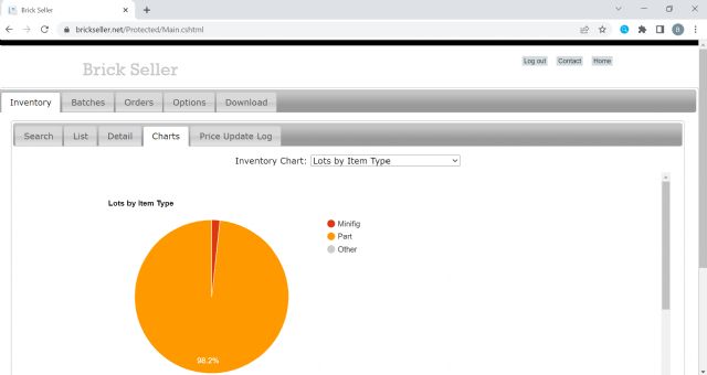
I have just release a new feature to Brick Seller that allows you to visualize
your Inventory data in several Charts/Graphs.
There is a new Charts tab under the main Inventory tab containing a dropdown
list to select one of the following:
Lots by Item Type
Qty by Item Type
Lots by Condition
Qty by Condition
Part Lots by Color
Part Qty by Color
Part Lots by Category
Part Qty by Category
Set Lots by Category
Set Qty by Category
Minifig Lots by Category
Minifig Qty by Category
Monthly Additions (Qty and $ Amount)
Monthly Additions By Item Type (Qty and $ Amount)
Monthly Ending Inventory (Qty and $ Amount)

)
)
)
)