Yesterday I busied myself finding tools that would lessen the effects of the
new changes on my workspace. This morning I really took a look at them without
my modifications.
Everything is black on white.
This is very challenging for me because every visual color cue is being stripped
from the site.
Every menu is just black words on white.
Hyperlinks have no clues via color or underline.
My only navigation aids are words. I am looking at an older monitor through 2.00x
reading glasses. (I can't be the only BL member in this situation.) My eyes
switch letters around all the time so everything now requires to me to hard focus
on reading the text of the link I need. No buttons, no boxes, no color, no static
position to memorize.
Everything is glaring white.
The swaths of blank white space is very glaring and difficult to look it. This
is especially true when trying to manage the drop down menus. The way they flash
down and cover the width of the entire screen is jarring.
The nav bar is tall and blank white and follows me everywhere I go and everything
I do.
None of the new features respect my Dark Mode choice. The blank white menu bars
cover what dark blue is visible on the sides of the page I am on. The new footer
is plain white with black text larger than anything else on my screen. It also
spans the whole width and covers what might be dark blue on my screen. For those
of us who have chosen Dark Mode, all of these new elements should be at least
slightly greyed out.
You've got global CSS running. You could do this. You have just chosen not
to.
The nav tools do not scale
There is no place without high black and white contrast for my eyes to rest.
I can usually counteract this on plain white websites by keeping my browser window
as narrow as possible so my desktop background fills some of my screen. But the
navigation for the site completely disappears at 1000 pixels. My monitor only
displays 1800 pixels. The nav bar and the search is only useable if my browser
is 1450 pixels wide. So, I can use the site at nearly full screen or not at
all. I have a second monitor that is vertical for ease of reading long lists
like inventories or part-outs. There are definitely no nav tools available to
me there.
I realize that these changes are just a first step towards making an upgraded
and more dynamic site. But you've failed to consider those of us who are
working here now.
Thanks,
~Jen
You would think with the 2021 accessibility lawsuit, they would have taken such
matters into consideration. But, I guess the judgement was not enough to have
them give a darn.
Sorry you're having to go through this Jen. This change has been handled
very poorly.
I am neurodivergent and the changes to the site sent me spinning Monday, (so
glad I have all the links I use regularly bookmarked) so I empathize completely
and wish Bricklink would be more considerate of their user base. But, you know
the old saying, wish in one hand, crap in the other, which hand will get full
first?
You would think with the 2021 accessibility lawsuit, they would have taken such
matters into consideration. But, I guess the judgement was not enough to have
them give a darn.
Interesting! I didn't know about that. I read through it and it was all very
valid. However, I am a sympathetic towards BrickLink on many of those points
as I know it must difficult to manage when you are working on a website with
4 or more different versions and layers of old pages. There must be a chasm
between the code for the main landing page and the code for my home, the Add
or Change page.
I have just started testing the new nav for accessibility regarding keyboard
only navigability. I try and Tab and Enter my way through most every page I can.
You should see me zip through some of the Catalog forms! No clicking required.
Anyway, nothing good to report on that front as, so far, nothing works at all.
Sorry you're having to go through this Jen. This change has been handled
very poorly.
That's kind of you to say.
I am neurodivergent and the changes to the site sent me spinning Monday, (so
glad I have all the links I use regularly bookmarked) so I empathize completely
and wish Bricklink would be more considerate of their user base.
Well, at least they tried to warn users about the changes this time. And they
finally made a change on a Monday workday! when they were there and ready to
fix things like the sticky monthly maintenance bar. But with no previews made
available and no transition period where you could switch back and take your
time learning it, they were not very accommodating to people who may have needed
it.
Anyway, I've got my mods turned back on and it's time to get back to
work!
...
Everything is black on white.
This is very challenging for me because every visual color cue is being stripped
from the site.
Every menu is just black words on white.
Hyperlinks have no clues via color or underline.
Yes, this feedback came back immediately from internal and external testing.
I'm not going to name names, but individuals in the BrickLink office have
exchanged "I told you so" looks and comments.
The lack of color wasn't prioritized over getting the underlying functionality
working correctly. You can't see it, but the underlying functionality is
more flexible, more scalable, and promises to allow quicker fixes/updates.
...
The nav tools do not scale
...
Agreed, we're working on that...
...
I realize that these changes are just a first step towards making an upgraded
and more dynamic site. But you've failed to consider those of us who are
working here now.
It is definitely a risk to inconvenience long-time users with any change, so
the team planned tentative steps for releases with time allotted for feedback
research, which we'll use to prioritize and add to the existing backlog.
We're listening!
...
Everything is black on white.
This is very challenging for me because every visual color cue is being stripped
from the site.
Every menu is just black words on white.
Hyperlinks have no clues via color or underline.
Yes, this feedback came back immediately from internal and external testing.
I'm not going to name names, but individuals in the BrickLink office have
exchanged "I told you so" looks and comments.
The lack of color wasn't prioritized over getting the underlying functionality
working correctly. You can't see it, but the underlying functionality is
more flexible, more scalable, and promises to allow quicker fixes/updates.
...
Everything is black on white.
This is very challenging for me because every visual color cue is being stripped
from the site.
Every menu is just black words on white.
Hyperlinks have no clues via color or underline.
Yes, this feedback came back immediately from internal and external testing.
I'm not going to name names, but individuals in the BrickLink office have
exchanged "I told you so" looks and comments.
The lack of color wasn't prioritized over getting the underlying functionality
working correctly. You can't see it, but the underlying functionality is
more flexible, more scalable, and promises to allow quicker fixes/updates.
I can see it a bit! Remember, I spent all day yesterday learning enough about
divs .classes and vars() to read your CSS and modify my view.
...
The nav tools do not scale
...
Agreed, we're working on that...
That's great to hear. Using the side menus is not ideal. One drop down hover
and click is better than 4 side panel swaps.
...
I realize that these changes are just a first step towards making an upgraded
and more dynamic site. But you've failed to consider those of us who are
working here now.
It is definitely a risk to inconvenience long-time users with any change, so
the team planned tentative steps for releases with time allotted for feedback
research, which we'll use to prioritize and add to the existing backlog.
We're listening!
Thanks, I do appreciate your response. I know there's a lot of negativity
flowing around here. I just needed to get all this said especially for those
users who might be feeling the same but not speaking up.
...
Everything is black on white.
This is very challenging for me because every visual color cue is being stripped
from the site.
Every menu is just black words on white.
Hyperlinks have no clues via color or underline.
Yes, this feedback came back immediately from internal and external testing.
I'm not going to name names, but individuals in the BrickLink office have
exchanged "I told you so" looks and comments.
The lack of color wasn't prioritized over getting the underlying functionality
working correctly. You can't see it, but the underlying functionality is
more flexible, more scalable, and promises to allow quicker fixes/updates.
...
The nav tools do not scale
...
Agreed, we're working on that...
...
I realize that these changes are just a first step towards making an upgraded
and more dynamic site. But you've failed to consider those of us who are
working here now.
It is definitely a risk to inconvenience long-time users with any change, so
the team planned tentative steps for releases with time allotted for feedback
research, which we'll use to prioritize and add to the existing backlog.
We're listening!
Yesterday I busied myself finding tools that would lessen the effects of the
new changes on my workspace. This morning I really took a look at them without
my modifications.
Everything is black on white.
This is very challenging for me because every visual color cue is being stripped
from the site.
Every menu is just black words on white.
Hyperlinks have no clues via color or underline.
My only navigation aids are words. I am looking at an older monitor through 2.00x
reading glasses. (I can't be the only BL member in this situation.) My eyes
switch letters around all the time so everything now requires to me to hard focus
on reading the text of the link I need. No buttons, no boxes, no color, no static
position to memorize.
Everything is glaring white.
The swaths of blank white space is very glaring and difficult to look it. This
is especially true when trying to manage the drop down menus. The way they flash
down and cover the width of the entire screen is jarring.
The nav bar is tall and blank white and follows me everywhere I go and everything
I do.
None of the new features respect my Dark Mode choice. The blank white menu bars
cover what dark blue is visible on the sides of the page I am on. The new footer
is plain white with black text larger than anything else on my screen. It also
spans the whole width and covers what might be dark blue on my screen. For those
of us who have chosen Dark Mode, all of these new elements should be at least
slightly greyed out.
You've got global CSS running. You could do this. You have just chosen not
to.
The nav tools do not scale
There is no place without high black and white contrast for my eyes to rest.
I can usually counteract this on plain white websites by keeping my browser window
as narrow as possible so my desktop background fills some of my screen. But the
navigation for the site completely disappears at 1000 pixels. My monitor only
displays 1800 pixels. The nav bar and the search is only useable if my browser
is 1450 pixels wide. So, I can use the site at nearly full screen or not at
all. I have a second monitor that is vertical for ease of reading long lists
like inventories or part-outs. There are definitely no nav tools available to
me there.
I realize that these changes are just a first step towards making an upgraded
and more dynamic site. But you've failed to consider those of us who are
working here now.
Thanks,
~Jen
I don't think anyone on the development team has ever read through the WCAG.
For those that don't know, the WCAG (Web Content Accessibility Guidelines)
is a set of best practices to make websites accessible for everyone, not just
for those who are 25 or younger and still have good eyes, good hearing, and good
use of their hands. There are different levels of compliance that can be obtained,
but I don't think any of this would pass even the most basic level of compliance.
I knew about accessibility when I was programming websites back in 2000 at the
age of 25. It is really upsetting that the next generation is not being taught
these essentials for proper web design.
I don't think anyone on the development team has ever read through the WCAG.
For those that don't know, the WCAG (Web Content Accessibility Guidelines)
is a set of best practices to make websites accessible for everyone, not just
for those who are 25 or younger and still have good eyes, good hearing, and good
use of their hands.
I would add to this: and working on a relatively new laptop.
There are different levels of compliance that can be obtained,
but I don't think any of this would pass even the most basic level of compliance.
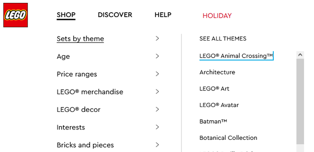
No, sadly, it wouldn't. But fingers crossed this is just their first step
and that they plan to fix it. The menus at LEGO.com look very like these and
all work with just keyboards. I just Tabbed my way over to a nice Animal Crossing
set.
Actually, the big, wide menus and spread out info makes sense there where you
are just showing up to look for, buy a thing, and head home. We actually work
here all day, so the idea that one design would accommodate both things is not
practical.
I don't think anyone on the development team has ever read through the WCAG.
For those that don't know, the WCAG (Web Content Accessibility Guidelines)
is a set of best practices to make websites accessible for everyone, not just
for those who are 25 or younger and still have good eyes, good hearing, and good
use of their hands.
I would add to this: and working on a relatively new laptop.
There are different levels of compliance that can be obtained,
but I don't think any of this would pass even the most basic level of compliance.
No, sadly, it wouldn't. But fingers crossed this is just their first step
and that they plan to fix it. The menus at LEGO.com look very like these and
all work with just keyboards. I just Tabbed my way over to a nice Animal Crossing
set.
Actually, the big, wide menus and spread out info makes sense there where you
are just showing up to look for, buy a thing, and head home. We actually work
here all day, so the idea that one design would accommodate both things is not
practical.
That gets back to my earlier point about this website being a productivity platform
for some but just a regular e-commerce site for others. Two widely different
use cases that need very different things from a header.
I don't think anyone on the development team has ever read through the WCAG.
For those that don't know, the WCAG (Web Content Accessibility Guidelines)
is a set of best practices to make websites accessible for everyone, not just
for those who are 25 or younger and still have good eyes, good hearing, and good
use of their hands. There are different levels of compliance that can be obtained,
but I don't think any of this would pass even the most basic level of compliance.
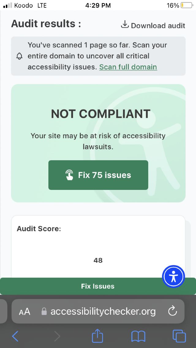
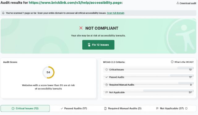
It is not compliant, as a matter of fact, if fails miserably! Bricklink learned
nothing in from the lawsuit in 2021.
I knew about accessibility when I was programming websites back in 2000 at the
age of 25. It is really upsetting that the next generation is not being taught
these essentials for proper web design.
I agree, plus how to do thoughtful deployments, user experience testing, and
a multitude of other best practices.
I don't think anyone on the development team has ever read through the WCAG.
For those that don't know, the WCAG (Web Content Accessibility Guidelines)
is a set of best practices to make websites accessible for everyone, not just
for those who are 25 or younger and still have good eyes, good hearing, and good
use of their hands. There are different levels of compliance that can be obtained,
but I don't think any of this would pass even the most basic level of compliance.
It is not compliant, as a matter of fact, if fails miserably! Bricklink learned
nothing in from the lawsuit in 2021.
I knew about accessibility when I was programming websites back in 2000 at the
age of 25. It is really upsetting that the next generation is not being taught
these essentials for proper web design.
I agree, plus how to do thoughtful deployments, user experience testing, and
a multitude of other best practices.
Yesterday I busied myself finding tools that would lessen the effects of the
new changes on my workspace. This morning I really took a look at them without
my modifications.
Everything is black on white.
This is very challenging for me because every visual color cue is being stripped
from the site.
Every menu is just black words on white.
Hyperlinks have no clues via color or underline.
My only navigation aids are words. I am looking at an older monitor through 2.00x
reading glasses. (I can't be the only BL member in this situation.) My eyes
switch letters around all the time so everything now requires to me to hard focus
on reading the text of the link I need. No buttons, no boxes, no color, no static
position to memorize.
Everything is glaring white.
The swaths of blank white space is very glaring and difficult to look it. This
is especially true when trying to manage the drop down menus. The way they flash
down and cover the width of the entire screen is jarring.
The nav bar is tall and blank white and follows me everywhere I go and everything
I do.
None of the new features respect my Dark Mode choice. The blank white menu bars
cover what dark blue is visible on the sides of the page I am on. The new footer
is plain white with black text larger than anything else on my screen. It also
spans the whole width and covers what might be dark blue on my screen. For those
of us who have chosen Dark Mode, all of these new elements should be at least
slightly greyed out.
You've got global CSS running. You could do this. You have just chosen not
to.
The nav tools do not scale
There is no place without high black and white contrast for my eyes to rest.
I can usually counteract this on plain white websites by keeping my browser window
as narrow as possible so my desktop background fills some of my screen. But the
navigation for the site completely disappears at 1000 pixels. My monitor only
displays 1800 pixels. The nav bar and the search is only useable if my browser
is 1450 pixels wide. So, I can use the site at nearly full screen or not at
all. I have a second monitor that is vertical for ease of reading long lists
like inventories or part-outs. There are definitely no nav tools available to
me there.
I realize that these changes are just a first step towards making an upgraded
and more dynamic site. But you've failed to consider those of us who are
working here now.
Thanks,
~Jen
I don't think anyone on the development team has ever read through the WCAG.
For those that don't know, the WCAG (Web Content Accessibility Guidelines)
is a set of best practices to make websites accessible for everyone, not just
for those who are 25 or younger and still have good eyes, good hearing, and good
use of their hands. There are different levels of compliance that can be obtained,
but I don't think any of this would pass even the most basic level of compliance.
I knew about accessibility when I was programming websites back in 2000 at the
age of 25. It is really upsetting that the next generation is not being taught
these essentials for proper web design.
Cheers,
Randy
Indeed I asked why so much big space and only text and not just some icons for
little things and was told that it is due to make the site more complaint on
accessibility.
Indeed I asked why so much big space and only text and not just some icons for
little things and was told that it is due to make the site more complaint on
accessibility.
That is not how accessibility works. I feel like you were fed a line of BS.