Has anyone found the new look useful or appealing? I would like to know your
opinion, thanks. (:
Here is mine:
Bricklink needed a upgrade, including easer ways to find certain pages and maybe
some rounded edges, like on most modern web pages, but this new update only made
using it harder for me.
I thought that with the new look the issue would have been fixed, but it still
won't let me stay sighed in!
The only thing that was changed is the look of the top bar and some of the links,
but I always liked the simple, old and grey look of Bricklink, and I realy would
like to switch back to the original but there's no option that I could find
to do so.
Sorry to be saying this, but, having a mixture of half of the site un-usefully
modern, and then the other half looking originally old is not a very nice experience
wile useing it.
Bricklink can be what it used to be and better, if an appropriate update is made,
or even an app on its own!
There are many things that are missing that were included, and so many that could
have been added but aren't.
It's like comparing Windows vs Linux;
one is more modern which includes many gadgets and is easy to use for simple,
everyday things but can have many tricky problems, most that can't be solved,
and the other looks a bit older but is as simple to use if not even easer as
it doesn't include those unnecessary additions and has a solution to everything!
(And this is what Bricklink should be like in my opinion, always).
Changes are good and useful ones can give a better experience when taken advantage
of them.
I know that there was a lot of work done to create this updated look and that
it was made to encourage new users to the site, but this one still needs some
work done because many of the users that already were using Bricklink are certainly
currently not having fun!
For me as a retailer who uses Bricklink every day, it has become more complicated
now... and it just looks ugly.
Before, it was nice! It worked. It was fast and you could access your pages more
quickly (even from your mobile phone!)
For me as a retailer who uses Bricklink every day, it has become more complicated
now... and it just looks ugly.
Before, it was nice! It worked. It was fast and you could access your pages more
quickly (even from your mobile phone!)
You have been a user for about 18 months and appear not to have bought anything.
It's fine... We've a nice Catalog made by volunteers so everyone can
freely buy and sell at eBay
Yeah, eBay. I have brought so many rare vintage LEGO sets there, saving them
by buying big bundles of dirty pieces, cleaning and putting them together again
by finding all of the right parts from the right era, all because Bricklink has
the information to do so...
You have been a user for about 18 months and appear not to have bought anything.
Yes, indeed. I sadly didn't have a chance and need to make myself an account
on Bricklink sooner, but I have been using it for 4 years now, on an almost daily
basis.
I can assure you, that I have brought a lot of LEGO since I begun collecting
it, although not on Bricklink itself.
IMO, it has just made navigation difficult. The search bar is shunted into a
corner in favor of Studio and BDP, two auxillery programs to Bricklink. Even
at that, everything is shunted into drop downs - Fancy DROP DOWNS do NOT make
your site better, it makes navigation more difficult. What used to be one click
away (i.e. the vast majority of the catalog/marketplace, the central purpose
of Bricklink) now requires you to dig through drop down menus. The drop down
buttons are also very inconspicious, text on a blank white background, nothing
to draw the eye. It doesn't even look good, where as the old design had...
well, design.
I see this as a step away from user-friendliness, and I can't imagine the
majority of people who use the site, and more importantly, new potential buyers,
having an easy time with it. It is very clear to me that user-friendliness was
never in the scope, but purely to bring these two programs to the center. It's
just another corporate web design killer created with no basic understanding
of human-centric design.
The fact that the search bar is a tiny little box is absurd.
Also there used to be 2 shopping cart views as a buyer - a standard one viewable
through the store - and a more detailed one viewable by clicking on the shopping
cart in the upper right corner.
The more detailed shopping cart gave item numbers for everything in your cart
- and if something became unavailable in your cart, there was an easy way to
delete all the sold out items at one time.
I can't get to that cart view anymore, and it is very annoying. I was looking
at an old cart where multiple things were sold out - and I had to individually
delete 20 items or just empty my whole cart and start again.
Now to access that cart view you need to click the button view all my carts at
the bottom and then select the one you want to check
Has anyone found the new look useful or appealing? I would like to know your
opinion, thanks. (:
Here is mine:
Bricklink needed a upgrade, including easer ways to find certain pages and maybe
some rounded edges, like on most modern web pages, but this new update only made
using it harder for me.
I thought that with the new look the issue would have been fixed, but it still
won't let me stay sighed in!
The only thing that was changed is the look of the top bar and some of the links,
but I always liked the simple, old and grey look of Bricklink, and I realy would
like to switch back to the original but there's no option that I could find
to do so.
Sorry to be saying this, but, having a mixture of half of the site un-usefully
modern, and then the other half looking originally old is not a very nice experience
wile useing it.
Bricklink can be what it used to be and better, if an appropriate update is made,
or even an app on its own!
There are many things that are missing that were included, and so many that could
have been added but aren't.
It's like comparing Windows vs Linux;
one is more modern which includes many gadgets and is easy to use for simple,
everyday things but can have many tricky problems, most that can't be solved,
and the other looks a bit older but is as simple to use if not even easer as
it doesn't include those unnecessary additions and has a solution to everything!
(And this is what Bricklink should be like in my opinion, always).
Changes are good and useful ones can give a better experience when taken advantage
of them.
I know that there was a lot of work done to create this updated look and that
it was made to encourage new users to the site, but this one still needs some
work done because many of the users that already were using Bricklink are certainly
currently not having fun!
Thanks, Kapz
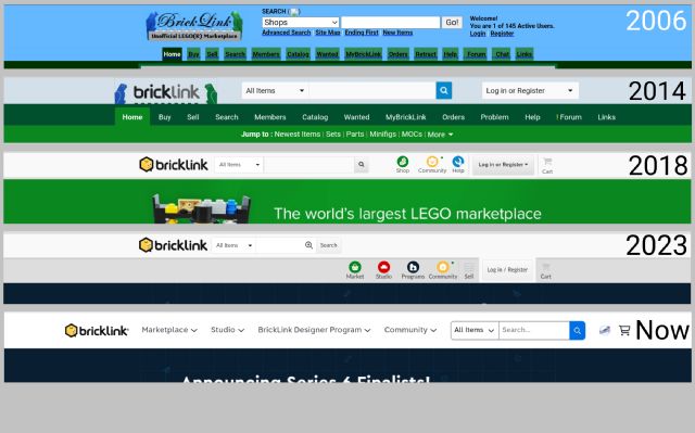
2006-2017
Those were great years....
Agreed. Every change admin makes as of the last several years is a step backwards.
Harder to navigate, combining part variants are just two recent ones. Whomever
they are discussing these updates with while in development don’t represent the
majority of the users. It’s sad to see the site continuously become harder to
use.
Has anyone found the new look useful or appealing? I would like to know your
opinion, thanks. (:
Here is mine:
Bricklink needed a upgrade, including easer ways to find certain pages and maybe
some rounded edges, like on most modern web pages, but this new update only made
using it harder for me.
I thought that with the new look the issue would have been fixed, but it still
won't let me stay sighed in!
The only thing that was changed is the look of the top bar and some of the links,
but I always liked the simple, old and grey look of Bricklink, and I realy would
like to switch back to the original but there's no option that I could find
to do so.
Sorry to be saying this, but, having a mixture of half of the site un-usefully
modern, and then the other half looking originally old is not a very nice experience
wile useing it.
Bricklink can be what it used to be and better, if an appropriate update is made,
or even an app on its own!
There are many things that are missing that were included, and so many that could
have been added but aren't.
It's like comparing Windows vs Linux;
one is more modern which includes many gadgets and is easy to use for simple,
everyday things but can have many tricky problems, most that can't be solved,
and the other looks a bit older but is as simple to use if not even easer as
it doesn't include those unnecessary additions and has a solution to everything!
(And this is what Bricklink should be like in my opinion, always).
Changes are good and useful ones can give a better experience when taken advantage
of them.
I know that there was a lot of work done to create this updated look and that
it was made to encourage new users to the site, but this one still needs some
work done because many of the users that already were using Bricklink are certainly
currently not having fun!
Thanks, Kapz
2006-2017
Those were great years....
Agreed. Every change admin makes as of the last several years is a step backwards.
Harder to navigate, combining part variants are just two recent ones. Whomever
they are discussing these updates with while in development don’t represent the
majority of the users. It’s sad to see the site continuously become harder to
use.
I definitely agree that the site needed an update, but I think they need to rethink
the UI and layout of the site
The navigation bar was fine before this update, the rest of the site is what
needed a facelift imo - the dropdown menus are kind of finnicky and annoying
to use, and the nav bar is too thick
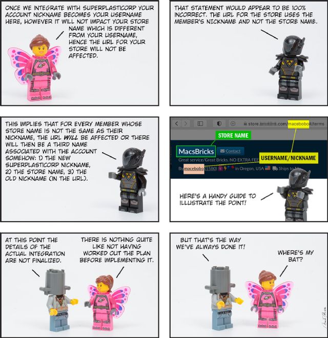
I'm also not a fan of the upcoming Lego.com account integration, but that's
a whole other thing that I'm hoping will at least work without any issues...
I'm also not a fan of the upcoming Lego.com account integration, but that's a whole other thing that I'm hoping will at least work without any issues...
Me too! At least they did not roll that out at the same time as the UI changes.
I still do not know if "they" understand how the stores are linked because
of the interaction Tanja had with the community when they first announced this
change.
Has anyone found the new look useful or appealing? I would like to know your
opinion, thanks. (:
Here is mine:
The short answer is.... no....
It has become more difficult to get into all the things I use on Bricklink :o
And I don't use drive thru or notify members so can you turn it off so it
doesn't count in the total number at the top?
In addition to that, I have the page at 150% which has never been a problem and
now the search field which I use very often is so small that it can only fit
half a letter...
Honestly? I haven’t had an issue with pages not loading which was my biggest
gripe. #smallvictories
I was about to say I have but then I remembered that was due to the 3-4 internet
outages we had this morning when I tried opening a page on bricklink 😅
Takes more mouse clicks to get where you want to go.
In General, Kapz writes:
Has anyone found the new look useful or appealing? I would like to know your
opinion, thanks. (:
Here is mine:
Bricklink needed a upgrade, including easer ways to find certain pages and maybe
some rounded edges, like on most modern web pages, but this new update only made
using it harder for me.
I thought that with the new look the issue would have been fixed, but it still
won't let me stay sighed in!
The only thing that was changed is the look of the top bar and some of the links,
but I always liked the simple, old and grey look of Bricklink, and I realy would
like to switch back to the original but there's no option that I could find
to do so.
Sorry to be saying this, but, having a mixture of half of the site un-usefully
modern, and then the other half looking originally old is not a very nice experience
wile useing it.
Bricklink can be what it used to be and better, if an appropriate update is made,
or even an app on its own!
There are many things that are missing that were included, and so many that could
have been added but aren't.
It's like comparing Windows vs Linux;
one is more modern which includes many gadgets and is easy to use for simple,
everyday things but can have many tricky problems, most that can't be solved,
and the other looks a bit older but is as simple to use if not even easer as
it doesn't include those unnecessary additions and has a solution to everything!
(And this is what Bricklink should be like in my opinion, always).
Changes are good and useful ones can give a better experience when taken advantage
of them.
I know that there was a lot of work done to create this updated look and that
it was made to encourage new users to the site, but this one still needs some
work done because many of the users that already were using Bricklink are certainly
currently not having fun!
Has anyone found the new look useful or appealing? I would like to know your
opinion, thanks. (:
Yes.
I like not having to scroll in a small box when selecting a part category to
search in the catalog. I like the new "view all carts" function where
instead of taking several clicks to get back to the store the cart is in, having
the "back to store" option there as soon as I click on the cart. However,
If I want the view where I can easily get to the catalog entry for the part,
it takes more clicks. I would not need to do the more clicks if sellers would
not turn off this very useful information in the cart shown via their store.
I don't know if the developers had anyone who was a major user of the site
helping them with design. I know when I was a software developer the user's
idea of what was a good interface often differed from mine, not just in features,
but in navigation. But with so many users I am certain that suiting all is a
major challenge.
So far the only major issue (which is a bug of sorts) that I have encountered
is the scroll bar on the side of the page when buying parts in a store. Sometimes
the scroll bar does not show up in the window on the left side, where one selects
what types of parts/sets to see. Sometimes I can get it to show by clicking
the down arrow, but not always. I have had to close the Sets portion so that
I could see enough of the parts section to select what I wanted.
I am using Chrome on a windows computer.
New website layout and update SUCKS!!! I hate it and I can't even find the
forum main page, lol. So they made it even worse! Thanks BL! lol
In General, Kapz writes:
Has anyone found the new look useful or appealing? I would like to know your
opinion, thanks. (:
Here is mine:
Bricklink needed a upgrade, including easer ways to find certain pages and maybe
some rounded edges, like on most modern web pages, but this new update only made
using it harder for me.
I thought that with the new look the issue would have been fixed, but it still
won't let me stay sighed in!
The only thing that was changed is the look of the top bar and some of the links,
but I always liked the simple, old and grey look of Bricklink, and I realy would
like to switch back to the original but there's no option that I could find
to do so.
Sorry to be saying this, but, having a mixture of half of the site un-usefully
modern, and then the other half looking originally old is not a very nice experience
wile useing it.
Bricklink can be what it used to be and better, if an appropriate update is made,
or even an app on its own!
There are many things that are missing that were included, and so many that could
have been added but aren't.
It's like comparing Windows vs Linux;
one is more modern which includes many gadgets and is easy to use for simple,
everyday things but can have many tricky problems, most that can't be solved,
and the other looks a bit older but is as simple to use if not even easer as
it doesn't include those unnecessary additions and has a solution to everything!
(And this is what Bricklink should be like in my opinion, always).
Changes are good and useful ones can give a better experience when taken advantage
of them.
I know that there was a lot of work done to create this updated look and that
it was made to encourage new users to the site, but this one still needs some
work done because many of the users that already were using Bricklink are certainly
currently not having fun!
Hi from France !
Honestly, this new interface is like worldwild polities, going nowhere !
As we read on Forum, Bricklink needed to be seriously updated (for exemple, research
is madly hallucinating : one different letter and you cannot find anything, research
program doesn't have any flexibilty or intuition, it's a shame)
And since the new interface, everything is getting boring and laborious, painstaking,
administrators shoot a bullet in their foot, but in ours too...
regards
solennejerome
The old part of the bricklink is now hidden under a new coat that you have to
laboriously click through. The bricklink page has changed from a comprehensive
sales and search portal (with minor errors) to an advertisement for Lego Studio.
RIP old and good bricklink. Totally disappointing 😭😭