The feedback as a seller is definitely negative, the number of click for the
same work as before is decuplicated.
I hope at least these two functions can be implemented:
1) the drop-down menu of the selection of where to search should remember the
last selected item, and not that every time it is necessary to click on "All
Items" again and select
2) every time you navigate the site or select where to search from drop-down
menu, you must click again in the "Search..." field to be able to write.
Activate automatically the key-focus on the search box when landing on Bricklink
page
I think the best solution is to be able to select a dedicated interface for sellers,
but this is perhaps too much to ask
A related issue is that each time you search the new screen will clear the search
field completely instead of retain your query. Makes it easier to search, tiny
modification, search again, etc.
A related issue is that each time you search the new screen will clear the search
field completely instead of retain your query. Makes it easier to search, tiny
modification, search again, etc.
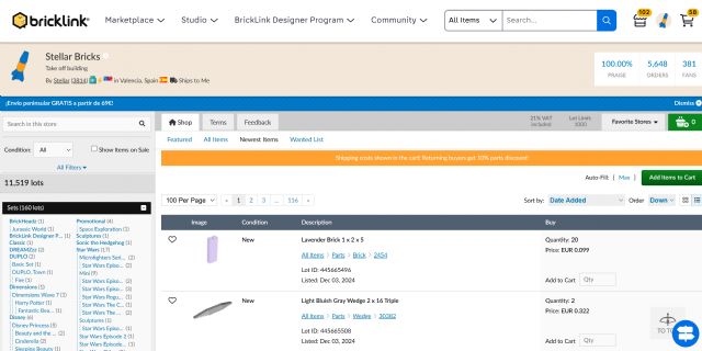
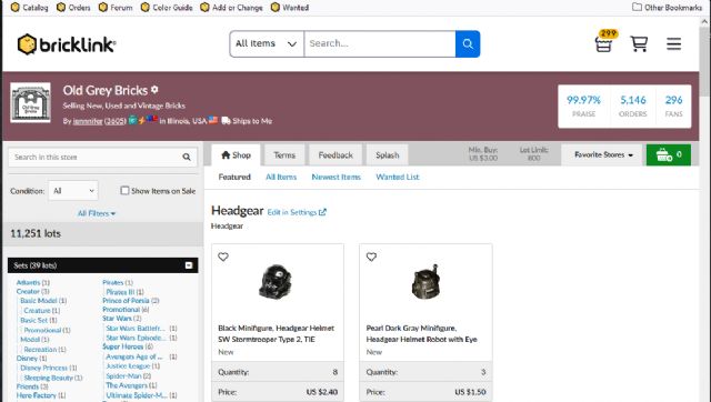
Another issue with the search box is that now it appears inside the Storefronts
and will confuse new buyers trying to search anything within a store only to
be directed away from it and to the catalog...
A related issue is that each time you search the new screen will clear the search
field completely instead of retain your query. Makes it easier to search, tiny
modification, search again, etc.
Another issue with the search box is that now it appears inside the Storefronts
and will confuse new buyers trying to search anything within a store only to
be directed away from it and to the catalog...
Yikes! Our stores have always been designed to keep people in your shop once
they arrive. I guess they just threw that baby out with the bathwater.
~Jen
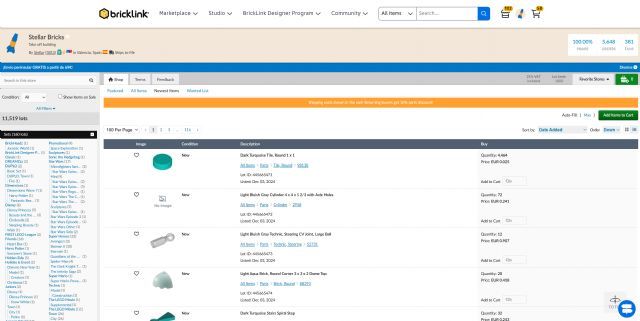
What do you think if the prominent "All Items, Search..." that now appears
above the store be changed to "This Store, Search..."?
That top-level "Search..." matches the in-store searching paradigm in
sites like eBay and Etsy (the store search is below the site search). BrickLink
doesn't have to be consistent with those sites, but it seems to be a conventional
user interface.
A related issue is that each time you search the new screen will clear the search
field completely instead of retain your query. Makes it easier to search, tiny
modification, search again, etc.
Another issue with the search box is that now it appears inside the Storefronts
and will confuse new buyers trying to search anything within a store only to
be directed away from it and to the catalog...
Yikes! Our stores have always been designed to keep people in your shop once
they arrive. I guess they just threw that baby out with the bathwater.
~Jen
What do you think if the prominent "All Items, Search..." that now appears
above the store be changed to "This Store, Search..."?
That top-level "Search..." matches the in-store searching paradigm in
sites like eBay and Etsy (the store search is below the site search). BrickLink
doesn't have to be consistent with those sites, but it seems to be a conventional
user interface.
Well, the new bar completely overwhelms the smaller store search. Especially
on mobile or browsers that are narrow and only showing the search and not the
menus. It would be amazing if anyone overcame this visual cue to actually search
in the shop...
~Jen
My prediction: New member finds an item somehow. Lands in a shop. Adds that item
to their cart. Decides to look for more stuff they want. Clicks on that All Items
search. Heads back to the Catalog pages. Clicks on another item. Wonders where
their cart is or their other item. Then...? The cart is all the way in the corner.
Will they notice it? Now they've got to head back and try again to find another
item in just that first shop. Have they just learned not to click on the obvious
search and dig for the other one? You tell me.
You really shouldn't direct buyers away from our shops. This nav bar is shouting
at buyers to leave our shops.
A related issue is that each time you search the new screen will clear the search
field completely instead of retain your query. Makes it easier to search, tiny
modification, search again, etc.
Another issue with the search box is that now it appears inside the Storefronts
and will confuse new buyers trying to search anything within a store only to
be directed away from it and to the catalog...
Yikes! Our stores have always been designed to keep people in your shop once
they arrive. I guess they just threw that baby out with the bathwater.
~Jen
What do you think if the prominent "All Items, Search..." that now appears
above the store be changed to "This Store, Search..."?
Yes - at the minimum!
The nav bar uses now 90 pixels, say 1/10 of the shop page, so that's a 10%
loss.
Much more, it was made before not to distract buyers when they're in a Shop
(apart the main BrickLink icon). We've lost this. I don't appreciate
this specific change.
+1 in the past, bricklink told us they avoided any changes that would draw buyers
out of stores. Now its the complete opposite and there is a search bar on the
top of the page which will lead users out of the store
Which is fine for me in your Shop, of course, but not mine!
I guess having it in your shop is ok but not mine!
A related issue is that each time you search the new screen will clear the search
field completely instead of retain your query. Makes it easier to search, tiny
modification, search again, etc.
Another issue with the search box is that now it appears inside the Storefronts
and will confuse new buyers trying to search anything within a store only to
be directed away from it and to the catalog...
Yikes! Our stores have always been designed to keep people in your shop once
they arrive. I guess they just threw that baby out with the bathwater.
~Jen
What do you think if the prominent "All Items, Search..." that now appears
above the store be changed to "This Store, Search..."?
That top-level "Search..." matches the in-store searching paradigm in
sites like eBay and Etsy (the store search is below the site search). BrickLink
doesn't have to be consistent with those sites, but it seems to be a conventional
user interface.
That seems would be okay, but reducing the height at least inside stores would
help too.
A related issue is that each time you search the new screen will clear the search
field completely instead of retain your query. Makes it easier to search, tiny
modification, search again, etc.
Another issue with the search box is that now it appears inside the Storefronts
and will confuse new buyers trying to search anything within a store only to
be directed away from it and to the catalog...
Yikes! Our stores have always been designed to keep people in your shop once
they arrive. I guess they just threw that baby out with the bathwater.
~Jen
On the bright side, at least that huge ugly footer, is not shown on the store
pages too.
Yes, I am grasping for something positive to say, since I have no orders to pack
this morning. Was on track to have a 20% year over year increase in sales, and
now nothing for nearly 12 hours. Coincidence? I think not.
Plus the radio silence from Bricklink admin is deafening.
Yes, I am grasping for something positive to say, since I have no orders to pack
this morning. Was on track to have a 20% year over year increase in sales, and
now nothing for nearly 12 hours. Coincidence? I think not.
I know it’s probably a coincidence on my end with the Canada Post strike now
over but I’m starting to get consistent sales again 😅
Good! I am glad someone is able to generate sales in this new environment.
My last order # was 27015516 on 16 Dec 2024 @ 21:30. It would be interesting
to see what InSpaceSync is seeing as regards to volume of orders.
A related issue is that each time you search the new screen will clear the search
field completely instead of retain your query. Makes it easier to search, tiny
modification, search again, etc.
Another issue with the search box is that now it appears inside the Storefronts
and will confuse new buyers trying to search anything within a store only to
be directed away from it and to the catalog...
the Serach box is now working much better, thanks for the very quick implementation
In General, PaoloBitta writes:
hi all,
The feedback as a seller is definitely negative, the number of click for the
same work as before is decuplicated.
I hope at least these two functions can be implemented:
1) the drop-down menu of the selection of where to search should remember the
last selected item, and not that every time it is necessary to click on "All
Items" again and select
2) every time you navigate the site or select where to search from drop-down
menu, you must click again in the "Search..." field to be able to write.
Activate automatically the key-focus on the search box when landing on Bricklink
page
I think the best solution is to be able to select a dedicated interface for sellers,
but this is perhaps too much to ask
)
)
)
)