I have just release a new feature to Brick Seller that allows you to visualize
your Order data in several Charts/Graphs.
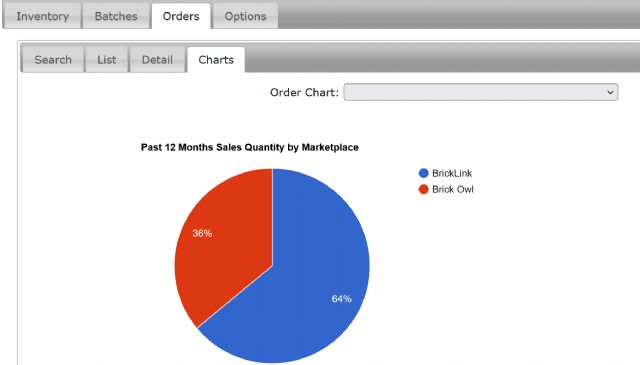
There is a new Charts tab under the main Orders tab containing a dropdown
list to select one of the following:
Monthly Sales
Monthly Sales by Marketplace (BrickLink and Brick Owl)
Monthly Sales by Item Type
Monthly Sales by Condition
These 4 show one bar chart with past 13 months $ amount sold and one bar chart
with past 13 months quantity sold.
Past 12 Months Sales Amount by Marketplace
Past 12 Months Sales Quantity by Marketplace
Past 12 Months Sales Amount by Item Type
Past 12 Months Sales Quantity by Item Type
Past 12 Months Sales Amount by Condition
Past 12 Months Sales Quantity by Condition
Past 12 Months Sales Amount by Category
Past 12 Months Sales Quantity by Category
Past 12 Months Sales Amount by Color
Past 12 Months Sales Quantity by Color
These show one Pie Chart and one Bar chart. By Category and Color show top 10
individually and the rest grouped in "Other".

)
)
)
)