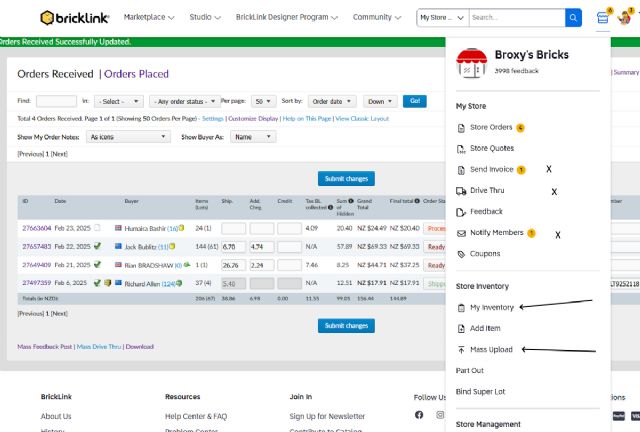
Not a real fan of the new menu layout as in the above example I NEVER use Send
Invoice, Drive through and notify members from the store menu, I do however constantly
use My inventory and mass upload and to get to those on the menu you have to
click on the menu then scroll down or have the screen reduced to be able to see
them which makes reading glasses even more necessary, how did you decide what
do do where? I wonder if it was based on anysort of analysis of which menu items
were actually used by store owners.
Regards
Andrew Broxholme
The analysis appeared to consist of: How can we make the menu flexible and make
the Bricklink Designer Program always findable.
The results, as I see them, seemed to center around solving design issues while
ignoring user preferences, efficiency, accessibility, and site function.