*loads much slower for those of us that are rural and on satellite.
*difficult to find most commonly used things as a seller. Much more drop downs
required.
*headed too large especially for mobile use.
*notifications are annoying and useless. Many do not use drive thru although
I do. I do not use the notify other feature. If having those notifications they
need to be customizable.
*wishlist hidden
That is all I can think of right now. How about you ask the people who use bricklink
what they want to see to make the site more user friendly. Most of the big sellers
are using outside programs to id and list items. how about keeping something
like that in house. work with those folks to make the site really useable for
sellers and ultimately buyers!!
Totally agree … why “fix” something that ain’t broken!?! I don’t see any “improvements”.
That is the problem in today's society...always messing with things that
work just fine so somebody can say "look what I did" when they just need
kicked in there...whoops...thinking out loud again.
Totally agree … why “fix” something that ain’t broken!?! I don’t see any “improvements”.
That is the problem in today's society...always messing with things that
work just fine
Our 1975 cars were working also; we shouldn't have made changes on them since
then. Changes some don't appreciate (and for some I don't).
Frankly I also loved programming in ASM on 8080 CPUs, but apart for the fun of
it I wouldn't like to have to use old computers right now, every day.
Evolution is necessary.
LOL, and the 1974 Chevrolet Caprice Classic!
But you wouldn't like to pay for its gas nowadays
In General, 1001bricks writes:
In General, rbritton31 writes:
In General, westcoasthayes writes:
Totally agree … why “fix” something that ain’t broken!?! I don’t see any “improvements”.
That is the problem in today's society...always messing with things that
work just fine
Our 1975 cars were working also; we shouldn't have made changes on them since
then. Changes some don't appreciate (and for some I don't).
Frankly I also loved programming in ASM on 8080 CPUs, but apart for the fun of
it I wouldn't like to have to use old computers right now, every day.
Evolution is necessary.
“Now, here, you see, it takes all the running you can do, to keep in the same
place. If you want to get somewhere else, you must run at least twice as fast
as that!”
“Now, here, you see, it takes all the running you can do, to keep in the same
place. If you want to get somewhere else, you must run at least twice as fast
as that!”
https://fs.blog/the-red-queen-effect/
However, not all animals evolve at the same rate. As Darwin observed, some are
more “responsive to change” than others.
I wonder what would Darwin say about the responsiveness of BrickLink's nav
bar.
*loads much slower for those of us that are rural and on satellite.
*difficult to find most commonly used things as a seller. Much more drop downs
required.
*headed too large especially for mobile use.
*notifications are annoying and useless. Many do not use drive thru although
I do. I do not use the notify other feature. If having those notifications they
need to be customizable.
*wishlist hidden
That is all I can think of right now. How about you ask the people who use bricklink
what they want to see to make the site more user friendly. Most of the big sellers
are using outside programs to id and list items. how about keeping something
like that in house. work with those folks to make the site really useable for
sellers and ultimately buyers!!
BL makes it NEARLY impossible to say anything positive after ANY updates they
do. As someone with some time invested here before it was even called BL makes
me wonder who these people are behind the scenes making design choices.
Administration needs to stop treating Live sites as testing ground for their
FILTHY updates. If you do not know how to do that. Then STOP IT.
- I've seen cleaner webdesign back in 1995 under html 2.0 done by 5th graders.
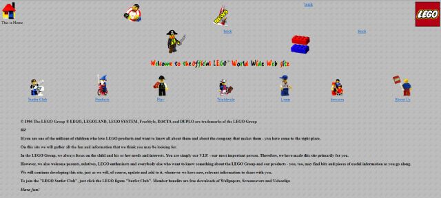
LEGO in 1996 - includes and animated gifs (and probably markee, didn't check)
I'm not sure it was better.
But for sure there were colors
*loads much slower for those of us that are rural and on satellite.
*difficult to find most commonly used things as a seller. Much more drop downs
required.
*headed too large especially for mobile use.
*notifications are annoying and useless. Many do not use drive thru although
I do. I do not use the notify other feature. If having those notifications they
need to be customizable.
*wishlist hidden
That is all I can think of right now. How about you ask the people who use bricklink
what they want to see to make the site more user friendly. Most of the big sellers
are using outside programs to id and list items. how about keeping something
like that in house. work with those folks to make the site really useable for
sellers and ultimately buyers!!
BL makes it NEARLY impossible to say anything positive after ANY updates they
do. As someone with some time invested here before it was even called BL makes
me wonder who these people are behind the scenes making design choices.
Administration needs to stop treating Live sites as testing ground for their
FILTHY updates. If you do not know how to do that. Then STOP IT.
- I've seen cleaner webdesign back in 1995 under html 2.0 done by 5th graders.
LEGO in 1996 - includes and animated gifs (and probably markee, didn't check)
I'm not sure it was better.
But for sure there were colors
Please I'd take that old site of LEGO's over this crap anyday. It loads
FAST and there is No embedded Garbage Harvesting your soul.
Agreed. It's like they are actively & intentionally trying to drive members
away. Due to my changing situations and looking ahead to an even more complicated
personal future, I have been contemplating selling out and quitting BL & Lego
selling altogether. Updates like this are a definite point towards quitting,
as it is more difficult & time consuming to do what I need to do, in the already
limited time I have. If they want to drive away their fee-paying members, I can
see this update doing an excellent job.
Miles
In General, Macaronis writes:
In General, galeatter writes:
*loads much slower for those of us that are rural and on satellite.
*difficult to find most commonly used things as a seller. Much more drop downs
required.
*headed too large especially for mobile use.
*notifications are annoying and useless. Many do not use drive thru although
I do. I do not use the notify other feature. If having those notifications they
need to be customizable.
*wishlist hidden
That is all I can think of right now. How about you ask the people who use bricklink
what they want to see to make the site more user friendly. Most of the big sellers
are using outside programs to id and list items. how about keeping something
like that in house. work with those folks to make the site really useable for
sellers and ultimately buyers!!
BL makes it NEARLY impossible to say anything positive after ANY updates they
do. As someone with some time invested here before it was even called BL makes
me wonder who these people are behind the scenes making design choices.
Administration needs to stop treating Live sites as testing ground for their
FILTHY updates. If you do not know how to do that. Then STOP IT.
- I've seen cleaner webdesign back in 1995 under html 2.0 done by 5th graders.
*loads much slower for those of us that are rural and on satellite.
*difficult to find most commonly used things as a seller. Much more drop downs
required.
One aspect of Bricklink that's always made me curious is related to load
times. When I'm importing an order to my Rebrickable inventory, it pops
up a Bricklink cross-site login page - which, like on the Bricklink homepage,
is username/password and a confirmation button, in a tiny window. The browser
informs me that this takes several MB to load and of course takes 5-6 seconds
as a result. Of course an 'enterprise' site isn't going to be designed
super efficiently, but surely some of that doesn't need to be in the login
page - for example, I can see that it's loaded a js file containing every
Lego colour, every Lego theme, every trademarked brand used in Lego, every state
in the world, every year Lego's been in existence, and more...
Very strongly agreed! Bricklink is one of the most useful and important Lego
sites there is and it is a shame to see it flattened down into "mobile-friendly"
design. I would like to see an option for Classic Appearance especially for PC
users.