I haven't really started looking at the more unique colors like trans and
metallic colors. I'll tackle those once I finish with the solid colors
I'd love to know what others think and if they have any better suggestions
for parts to use for the colors I listed or suggestions on additional colors
that I might be able to add that I didn't list.
Also if anyone knows a good way to arrange all the colors that's a little
more "smooth" on the gradient (more like a rainbow) than what I did, that would
be awesome.
-Pete
I've been building a color pallet of just the more recent colors (2000+)
and have found this link to be helpful.
I haven't really started looking at the more unique colors like trans and
metallic colors. I'll tackle those once I finish with the solid colors
I'd love to know what others think and if they have any better suggestions
for parts to use for the colors I listed or suggestions on additional colors
that I might be able to add that I didn't list.
Also if anyone knows a good way to arrange all the colors that's a little
more "smooth" on the gradient (more like a rainbow) than what I did, that would
be awesome.
-Pete
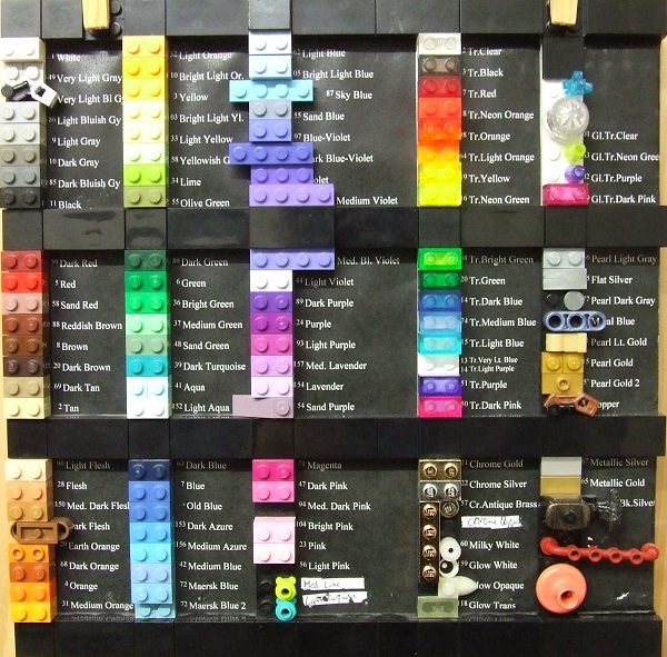
I did not go for smoothness, but for Bricklink-compatibily and recognizability.
Mounted on a paper covered
I've split the Blue / Old Blue, Medium Violet / Medium Bluish Violet, Maersk
Blue and Maersk Blue 2, Pearl Gold / Pearl Gold 2 entries as I found them two
too distinct colors in one Bricklink entry.
A Rainbow sorts light frequency, not absorbtive colors. If you want to use it
as a chart for identifying colors, you'd better stick with the Bricklink
ordering in categories.
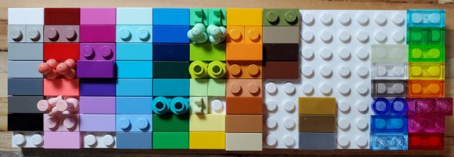
I like this color guide a lot. Very neat and well organized. I actually have
a second guide that is mostly 2x4s on a 32x32 baseplate. It works really well,
but the problem is that it just takes up a lot of space. So my main purpose
here is trying to make a small compact one.
I haven't really started looking at the more unique colors like trans and
metallic colors. I'll tackle those once I finish with the solid colors
I'd love to know what others think and if they have any better suggestions
for parts to use for the colors I listed or suggestions on additional colors
that I might be able to add that I didn't list.
Also if anyone knows a good way to arrange all the colors that's a little
more "smooth" on the gradient (more like a rainbow) than what I did, that would
be awesome.
-Pete
I did not go for smoothness, but for Bricklink-compatibily and recognizability.
Mounted on a paper covered
I've split the Blue / Old Blue, Medium Violet / Medium Bluish Violet, Maersk
Blue and Maersk Blue 2, Pearl Gold / Pearl Gold 2 entries as I found them two
too distinct colors in one Bricklink entry.
A Rainbow sorts light frequency, not absorbtive colors. If you want to use it
as a chart for identifying colors, you'd better stick with the Bricklink
ordering in categories.
That is a really nice color guide. I like how all the colors are labeled ap that
you can hold up another part and know for sure what color it is.
I haven't really started looking at the more unique colors like trans and
metallic colors. I'll tackle those once I finish with the solid colors
I'd love to know what others think and if they have any better suggestions
for parts to use for the colors I listed or suggestions on additional colors
that I might be able to add that I didn't list.
Also if anyone knows a good way to arrange all the colors that's a little
more "smooth" on the gradient (more like a rainbow) than what I did, that would
be awesome.
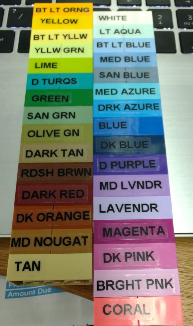
Here is the one that I've started. I know all colors aren't available
in a 2x4 brick (or I don't have them), so I am using 1x2's and 1x4's
for some of the spots. I got a DYMO label maker for Christmas so I could print
the color on each one.


")