I'd been meaning to do this, and the roundtable conversation reminded me.
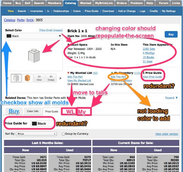
I believe there are a number of changes to the preview catalog item page for
parts that would be beneficial. I've attached a marked up screen shot, but
I will also write out as narrative.
1. The page should allow you to drill down from a part to a color, and update
all of the stats on the page. Currently if you change color, only some things
are changed. It would be more intuitive to unify the screen behavior so that
the selectors control all information displayed.
2. Conversely, you should be able to select one or all (roll up) variations of
a part. This should update stats but also the content of all the tab boxes.
This option should be moved up and visually grouped with the color selector.
I think the default should be "show all variations" but maybe this could be
added as a user preference to override for more experienced users.
3. The View My Wanted List and View My Inventory links in the center would function
more meaningfully as tabs in the bottom section (hide those tabs if user not
logged in).
4. There are a couple of redundant items. There is a "buy" button in the upper
right and a "store inventory" tab below. The "store inventory" label could be
confusing. I suggest renaming it to "buy" and eliminating the button. The price
guide does not need to be both a link and a tab. And having two color selector
boxes is redundant if you align to the principal in #1 that the selectors update
all info on the page.
5. Changing the color should change the pictures (not sure if this is a bug).
6. There is a bug on "add this part" link not populating the color on the target
page.
4. There are a couple of redundant items. There is a "buy" button in the upper
right and a "store inventory" tab below. The "store inventory" label could be
confusing. I suggest renaming it to "buy" and eliminating the button. The price
guide does not need to be both a link and a tab. And having two color selector
boxes is redundant if you align to the principal in #1 that the selectors update
all info on the page.
Just my personal opinion, but there can not be too many links to PG. From my
experience, way too many users do not even know it exists. Not sure how they
are doing their buying..
If you ask me, PG should be the default interface whenever a price of a single
item is shown to you. PG also should have filters for qty, and, looking into
the future, also filters for sellers (shipping time, various other stats).