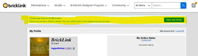
For a couple of years now this message is displayed on My BrickLink page.
I'm not using this new look because the old/current one works perfectly fine
for me.
But now with the latest update on top of this, it is becoming a messy and confusing
UI.
Personally I don't feel invited by all this to use BrickLink more, only less.
Hence, I wish we will get (another) new integrated and functional UI soon, with
a coherent look & feel.
I totally agree. I think that many times the "improvements" of the marketplaces
only make previous editions worse. I don't understand why they want to confuse
the user and hide functions that worked perfectly before. Why don't they
ever conduct surveys and act unilaterally? I hope they fix it.